Evolving Enterprise Analytics Alongside a Fast-Changing AI Product
Over nearly three years, I evolved Tabnine’s analytics experience as the product expanded from code completions into Chat, Agent, external models, tools, tokens, and cost — continuously adapting the system to new customer questions and more complex data.
- Analytics UX
- Enterprise Admin
- AI Usage
- Data-heavy UI
- Product Strategy
Executive summary
- The problem
- Analytics at Tabnine was never a one-time dashboard project — as the AI product expanded from code completions into Chat, Agent, models, tokens, and eventually cost, the meaning of “usage” kept changing with it.
- My contribution
- I continuously evolved the analytics experience throughout that change — redesigning existing surfaces, introducing new ones, restructuring information as product concepts changed, working with Product and Data on metric definitions, and gradually moving Analytics into Tabnine’s newer visual language and Design System.
- The outcome
- An analytics system that could evolve with the product rather than being tied to a fixed set of reports — supported by stable audience questions, role-appropriate visibility, clearer information architecture, and explicit rules for which metrics were trustworthy enough to expose.
This case study spans nearly three years of continuous work on Tabnine Analytics. It did not begin with a blank slate or have a single redesign moment.
As Tabnine evolved from code completions into Chat, Agent, models, tools, tokens, and cost, the questions enterprise customers needed Analytics to answer changed with it.
My challenge was to keep the experience coherent while the product taxonomy, available data, and visual system continued to evolve.
The hard part wasn’t adding more charts. It was keeping Analytics meaningful as “usage” kept changing.
Early in the product lifecycle, adoption was the primary concern.
Admins and managers wanted to know whether developers had installed Tabnine, whether they were active, and whether adoption was growing across the organization.
As the product matured, that question became more complex.
Adoption → Capability Usage → Models & Tokens → Cost
Customers began asking:
- Which capabilities are people actually using?
- How does usage differ between teams?
- Which users are most active?
- Is usage shifting from completions to Chat or Agent?
- Which models are being consumed?
- Which MCP servers and tools are driving Agent activity?
- How many tokens are being consumed?
- What is driving that consumption?
- What does it cost?
At the same time, the data itself was evolving. Analytics drew from product events, APIs, and different data pipelines. The same conceptual metric could vary by source, timeframe, maturity, or calculation.
That made analytics design partly an information-design problem and partly a data-trust problem.
The question was not only what would be useful to show? It was also what can we confidently defend as true?
The questions stayed more stable than the metrics.
Although the product and data changed dramatically, the core audiences provided a useful lens throughout the work. The answers evolved; the underlying questions were more persistent.
The system also had to respect role-based access: individual users, team managers, and admins had different questions — and different levels of visibility into organizational data.
- 01
Individual user
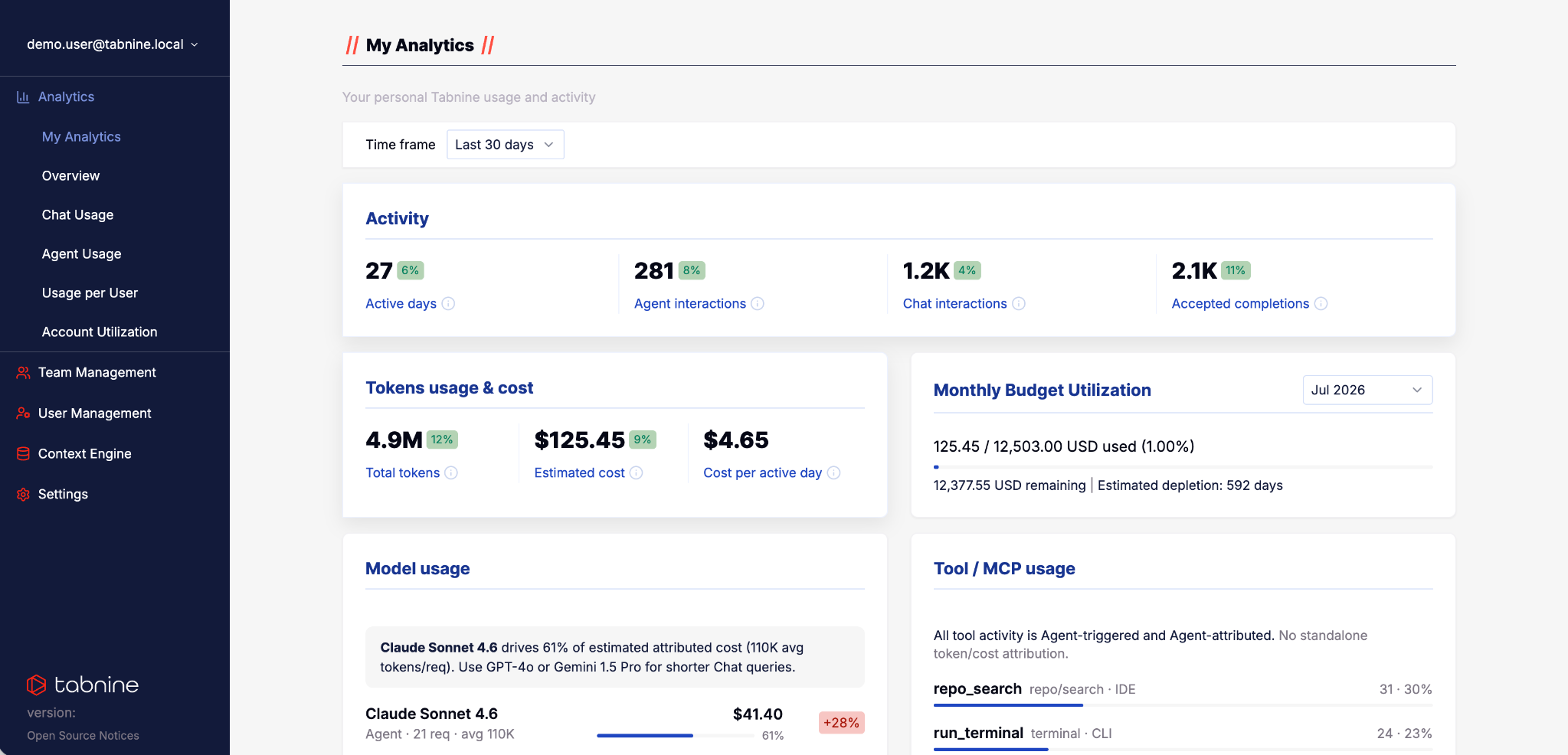
“How am I using Tabnine?” For much of the product’s history, there was no dedicated personal analytics experience. My Analytics introduced a personal view where users could see their own activity and consumption, scoped to their own data.
- 02
Team lead / manager
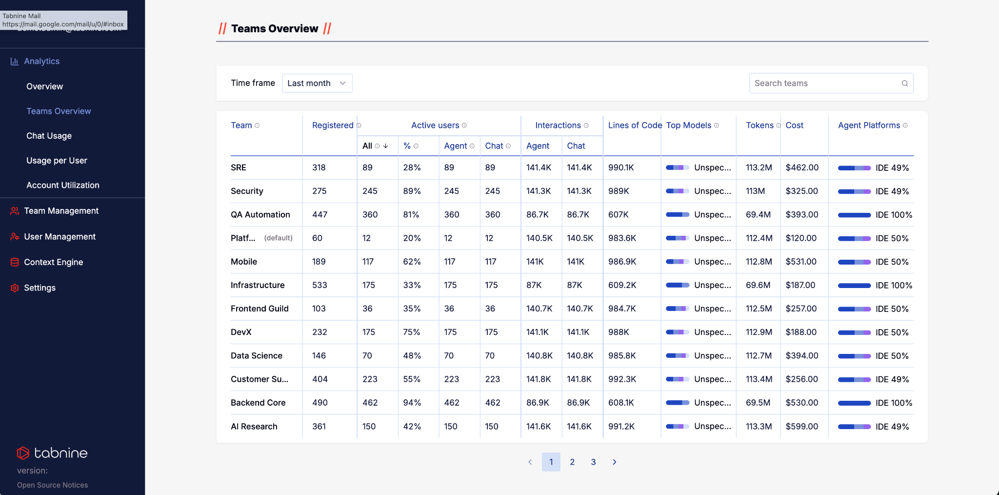
“How is my team using and adopting Tabnine?” Team-level analysis was not new — existing surfaces already allowed users with the appropriate access to filter data by team and inspect a specific team. The more recent opportunity was different: allowing authorized users to compare multiple teams side-by-side rather than inspecting them one at a time. That became Teams Overview.
- 03
Admin
“Are people in my organization using Tabnine, and how?” Admins have the broadest organizational view, and over time that view expanded from adoption and active users into capabilities, models, tokens, and cost.
- 04
Technical / product owner
“What is driving AI usage?” As Agent, external models, MCP servers, tools, and Bring Your Own AI became more important, technical usage required deeper visibility. The analytics system needed to explain not only how much activity existed, but increasingly what was driving it.
The product changed. The analytics model had to change with it.
Rather than treating every new capability as another dashboard, I used the same audience questions to evaluate what information still mattered, what needed to be added, and what had become less relevant.
Adoption
Early analytics focused heavily on whether users were active and whether enterprise adoption was growing. At this stage, completions were a much more central part of both the product and its measurement.
Capability usage
As Chat grew and Agent emerged, “usage” could no longer be represented as a single behavior. The analytics model had to distinguish between different ways developers interacted with Tabnine and allow those distinctions to evolve with the product.
Models & tokens
As model choice expanded — particularly with Bring Your Own AI — customers increasingly needed visibility into model consumption. Tokens became a meaningful operational metric rather than an implementation detail.
Cost
Once token consumption became significant at enterprise scale, another question followed naturally: what does this usage cost, and what is driving that cost? That became the next layer of the analytics experience.
Analytics grew as new product questions appeared.
The analytics experience did not evolve as one large redesign. New surfaces appeared over time as the product expanded and customers needed to understand new forms of usage.
The sequence also reflects how Tabnine itself changed.
Surface 01: Overview
The original broad admin-facing analytics surface focused primarily on organizational adoption and activity. Team-level analysis already existed here through filtering, long before Teams Overview was introduced.Surface 02: My Analytics
My Analytics introduced a dedicated personal view for the first time, giving individual users visibility into their own activity and relevant consumption. The information shown is scoped according to role and permissions.Surface 03: Chat Analytics
As Chat became more important, it required its own analytics context and metrics. Over time, the distinction between Chat and more agentic behavior also began to evolve, requiring the analytics architecture to keep adapting.Surface 04: Agent Analytics
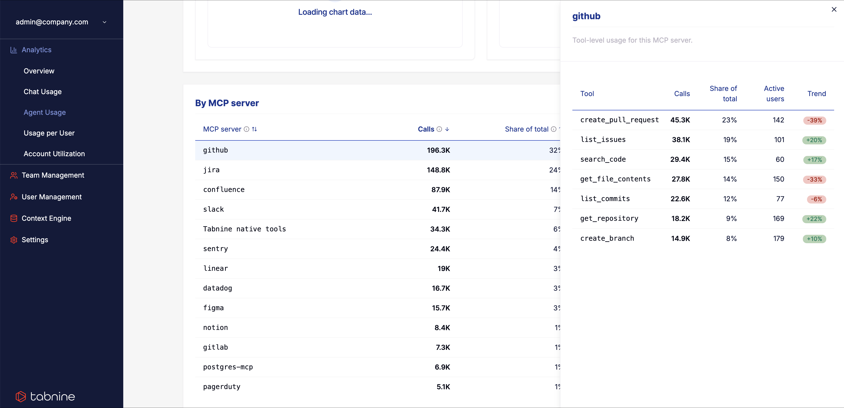
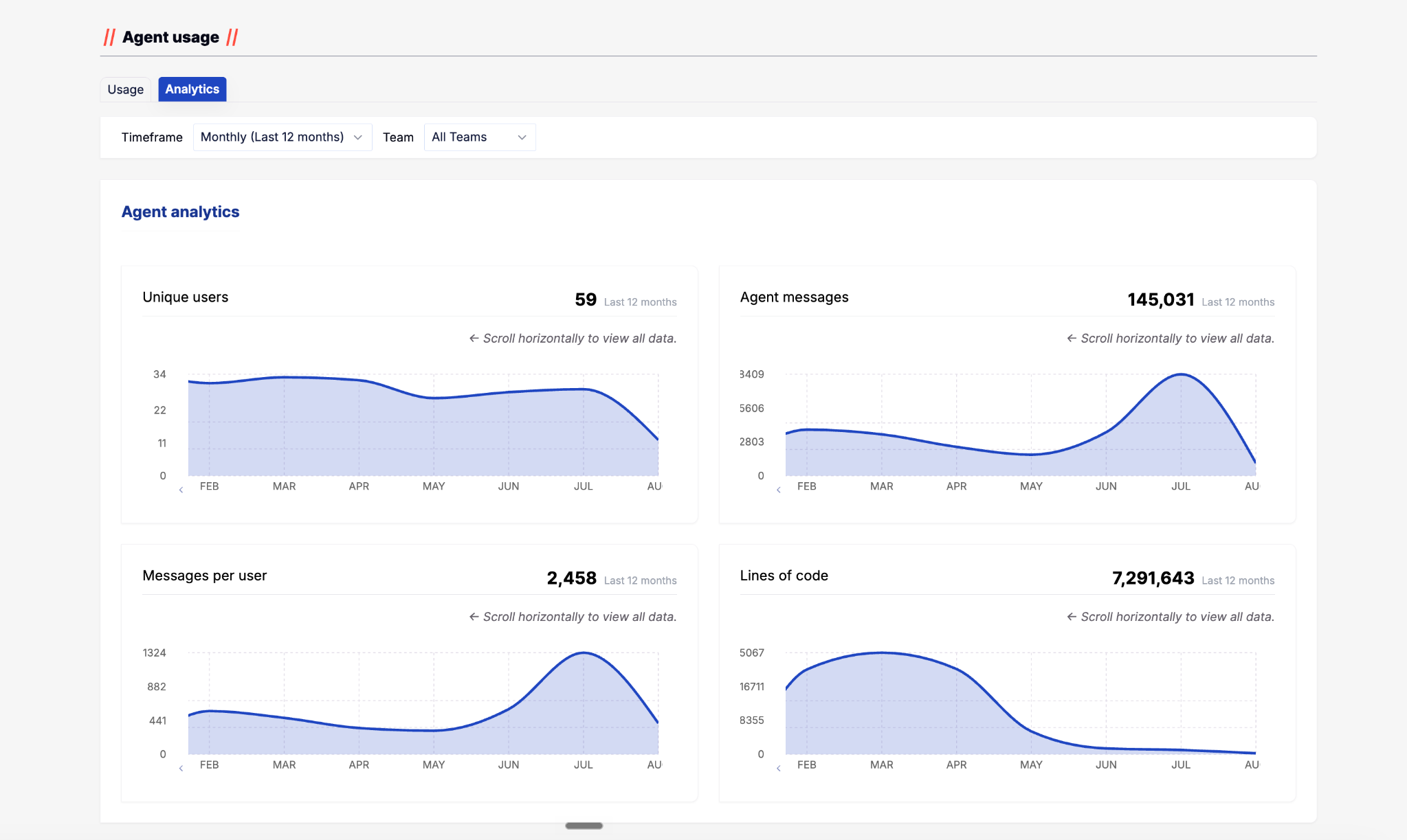
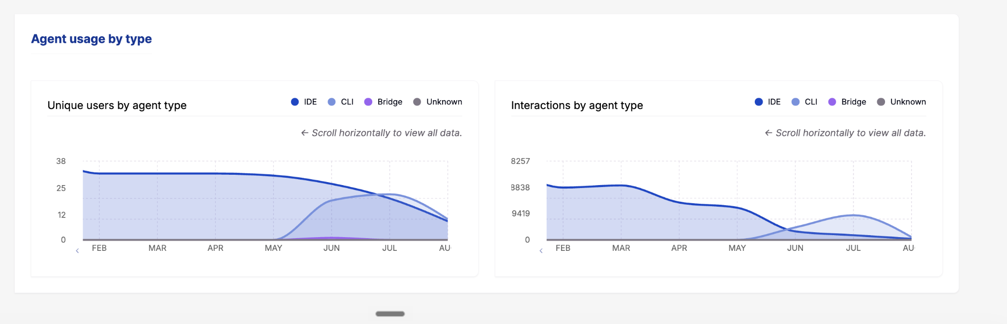
Agent introduced a richer set of behaviors to measure, expanding Analytics from basic activity into users, messages, Agent types, MCP servers, and tools.
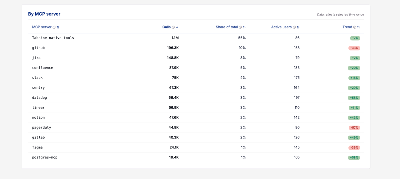
As the capability matured, we also separated Analytics — for investigating behavior over a selected timeframe — from Usage, which remained tied to quota and its account cycle. MCP reporting later expanded into richer server- and tool-level analysis.
Surface 05: Teams Overview
Team-level data already existed through filters in earlier analytics surfaces. Teams Overview introduced a different capability: comparing multiple teams side-by-side to identify meaningful differences in adoption and behavior.Surface 06: Users Overview
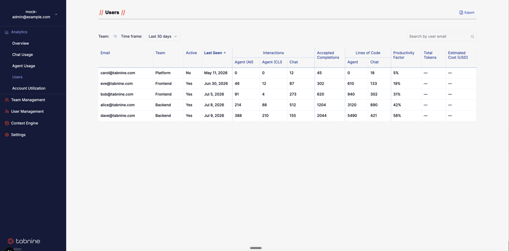
Users Overview provides the corresponding user-level comparison surface, redesigned for faster scanning, clearer activity states, improved terminology, sortable data, and richer usage context.
Teams Overview → compare teams. Users Overview → compare individual users.
Surface 07: Account Utilization
Account Utilization serves a different purpose from product analytics. It shows licensed-seat utilization — licensed seats used relative to the organization’s licensed-user quota.
It is separate from token consumption, AI usage quota, and Agent quota.
The calls that shaped the work.
The decisions that kept the system coherent through change.
Design Analytics as an evolving system, not a collection of reports.
The decision
Treat every new analytics requirement as part of a broader system rather than automatically adding another standalone report. As the product changed, I reviewed how new information related to existing surfaces, terminology, audiences, and time models. That sometimes meant adding a surface — and other times restructuring, merging, separating, or reducing existing ones.
Why this mattered
The product taxonomy itself was changing. An analytics architecture built around a snapshot of the product would quickly become outdated. The system needed to support evolution rather than preserve historical distinctions indefinitely.
Keep audience questions stable while allowing metrics to evolve.
The decision
Use persistent audience needs as the organizing layer, while allowing the metrics underneath them to change. A manager’s core question remained “How is my team using Tabnine?” — but the answer changed from active users and completions to richer combinations of Chat, Agent, models, tokens, and other capabilities.
Why this mattered
It gave the analytics system continuity even when the product changed rapidly. Instead of rebuilding the mental model every time a new AI capability appeared, we could ask whether the new data improved an existing answer or required a genuinely new one.
Add cross-team comparison without pretending team analytics was new.
The decision
Create Teams Overview as a dedicated comparison surface across teams. Existing analytics already supported filtering by an individual team. The new design solved a different problem: comparing teams together and identifying differences in adoption and behavior at a glance.
Why this mattered
Filtering answers “What is happening in this team?” Comparison answers “Where are the meaningful differences across my organization?” Those are different analytical tasks and required different information structures.
Introduce personal Analytics without creating a leaderboard.
The decision
Create My Analytics as a personal usage experience, focused on self-awareness rather than performance ranking. Individual users could understand their own activity and consumption without being positioned inside an employee leaderboard.
Why this mattered
As tokens, models, and AI consumption became more visible, individuals also needed transparency into their own usage. But making that information useful did not require turning it into a productivity score.
Let Agent Analytics grow with the capability.
The decision
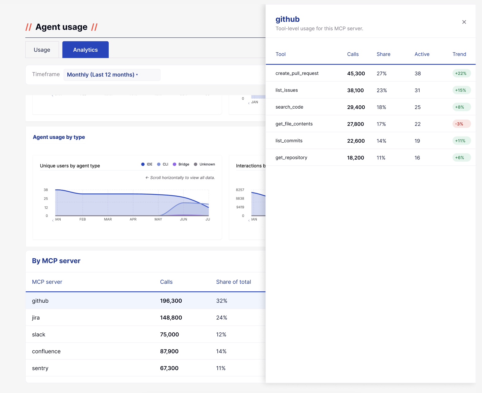
As Agent became more complex, its analytics needed to evolve beyond basic usage indicators. We expanded the experience to show overall activity, Agent types, MCP servers, and tools, while separating Analytics for behavioral investigation from Usage for quota tracking. MCP reporting, previously more limited inside Usage, was expanded into richer server- and tool-level analysis within Analytics.
Why this mattered
The challenge was no longer simply to report whether Agent was being used. As Agent matured, customers needed to understand how it was being used and what was driving that activity. Separating behavioral Analytics from quota-oriented Usage created a clearer information model, while richer MCP and tool breakdowns gave admins and technical stakeholders a more useful picture of real Agent behavior.
Treat metric readiness as a UX constraint.
The decision
Only promote metrics to customer-facing Analytics when the underlying data is reliable enough to support them. Reliability, freshness, calculation logic, and insufficient-data states became part of the design discussion rather than downstream implementation details.
Why this mattered
Showing a number we couldn’t defend was a bigger risk than showing fewer numbers. That trade-off affected scope, rollout sequencing, terminology, and even which product questions we were ready to answer. The work required ongoing alignment with Product, Engineering, and the teams responsible for APIs and data pipelines before locking the UI.
The latest evolution of the system.
The most recent work focused on gaps that became more important as enterprise AI usage matured. The screenshots shown here represent this latest phase rather than the beginning of the Analytics work.
My Analytics
My Analytics introduced a dedicated personal analytics surface for individual users, giving them visibility into their own activity and relevant consumption data without framing it as employee performance.
Teams Overview
Teams Overview introduced direct cross-team comparison, building on the team filtering already available in existing Analytics. It helps admins and managers identify differences in adoption and usage across teams.
Users Overview
Users Overview was redesigned for faster scanning and clearer comparison, with improved terminology, activity states, sortable columns, and richer usage context.
Teams Overview → compare teams. Users Overview → compare individual users.
Agent Analytics
Agent Analytics became substantially richer as Agent itself matured, expanding from overall adoption into behavior, Agent types, MCP servers, and tools.
The Analytics view supports investigation over a selected timeframe, while Usage remains tied to quota and its relevant account cycle.
MCP analysis also expanded from a more limited view into server-level trends, active users, usage volume, and tool-level drill-down.
Not every available event should become a metric.
One of the recurring challenges in Analytics was that product instrumentation often evolved faster than customer-facing reporting. An event could exist in a data pipeline without being ready to become a product metric.
Before promoting data into the interface, we needed to understand: Is the event consistently captured? Is the definition stable? Can users interpret it correctly? Is the timeframe meaningful? Is the data fresh enough? What happens when data is incomplete? Would Product, Engineering, and Data all explain the number the same way?
This affected UI decisions directly. Sometimes the right design decision was not to add another metric yet.
Analytics only creates trust when the product is explicit about what it actually knows.
Evolving the visual system while the product kept moving.
Around two years into this work, Tabnine introduced a broader rebrand and a new visual direction for the product.
The migration could not happen as a standalone redesign project because ongoing product work continued to take priority. Instead, whenever we meaningfully updated an Analytics surface, we also brought it closer to the new visual language.
At the same time, I was building Tabnine’s new Design System, which gave us a more consistent foundation for components, tables, states, spacing, and interaction patterns.
This allowed us to reduce visual and interaction debt gradually, as part of ongoing product development rather than a separate cosmetic redesign effort.
Related work: Tabnine Design System →
What changed across the product area.
The strongest outcome was not a single new dashboard. It was maintaining a usable analytics model across multiple generations of the product.
Outcomes
- Analytics evolved from adoption reporting into a system supporting capabilities, models, tokens, and cost.
- New personal and cross-team comparison experiences were introduced while existing user-level analytics continued to evolve.
- Agent Analytics expanded into richer behavior, Agent-type, MCP server, and tool-level analysis.
- A clearer distinction was established between behavioral Analytics, quota-oriented Usage, and licensed-seat utilization.
- Metric readiness and role-based visibility became explicit UX constraints shared across Product, Engineering, and Data.
- Analytics gradually migrated into the new brand and Design System while ongoing product development continued.
Extending Analytics into cost visibility.
Designed · PM aligned · Not yet implemented
Cost visibility was not a disconnected analytics feature. It was the next step in the same evolution — from early adoption questions, to capability usage, to model choice and token consumption, until consumption became a financial question. I designed Cost & Models to help admins understand not only how much AI usage cost, but what was driving that spend.
See cost health at a glance.
Total cost, efficiency, budget utilization, and cost trends surface the current state before deeper investigation.
Understand what drives spend.
Breakdowns by team, capability, platform, and model help admins move from “cost increased” to understanding what caused it to increase.
Keep different quota concepts separate.
Cost analysis follows a selectable timeframe. Contractual or account-based quota can operate on a calendar cycle. Licensed-user utilization is a separate concept again. Keeping those models explicit prevents different meanings of “usage” and “quota” from collapsing into one number.
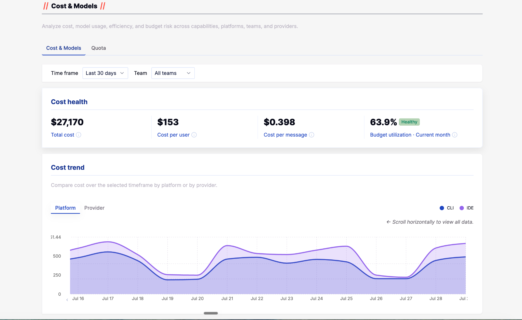
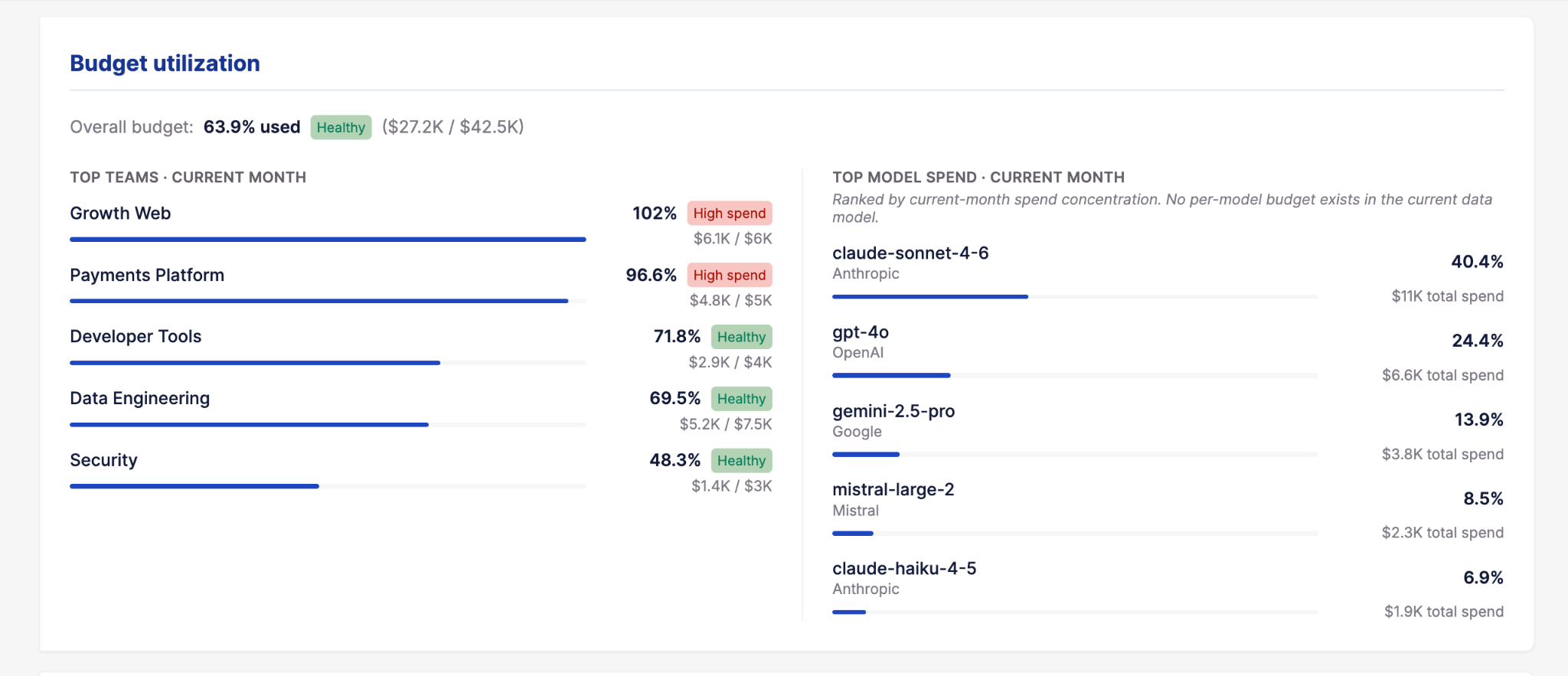
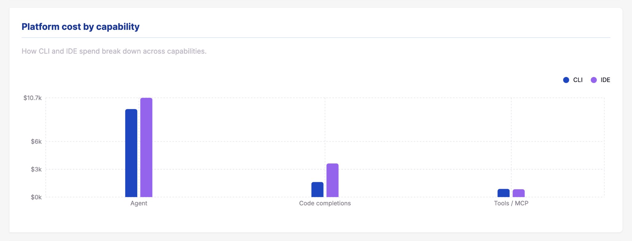
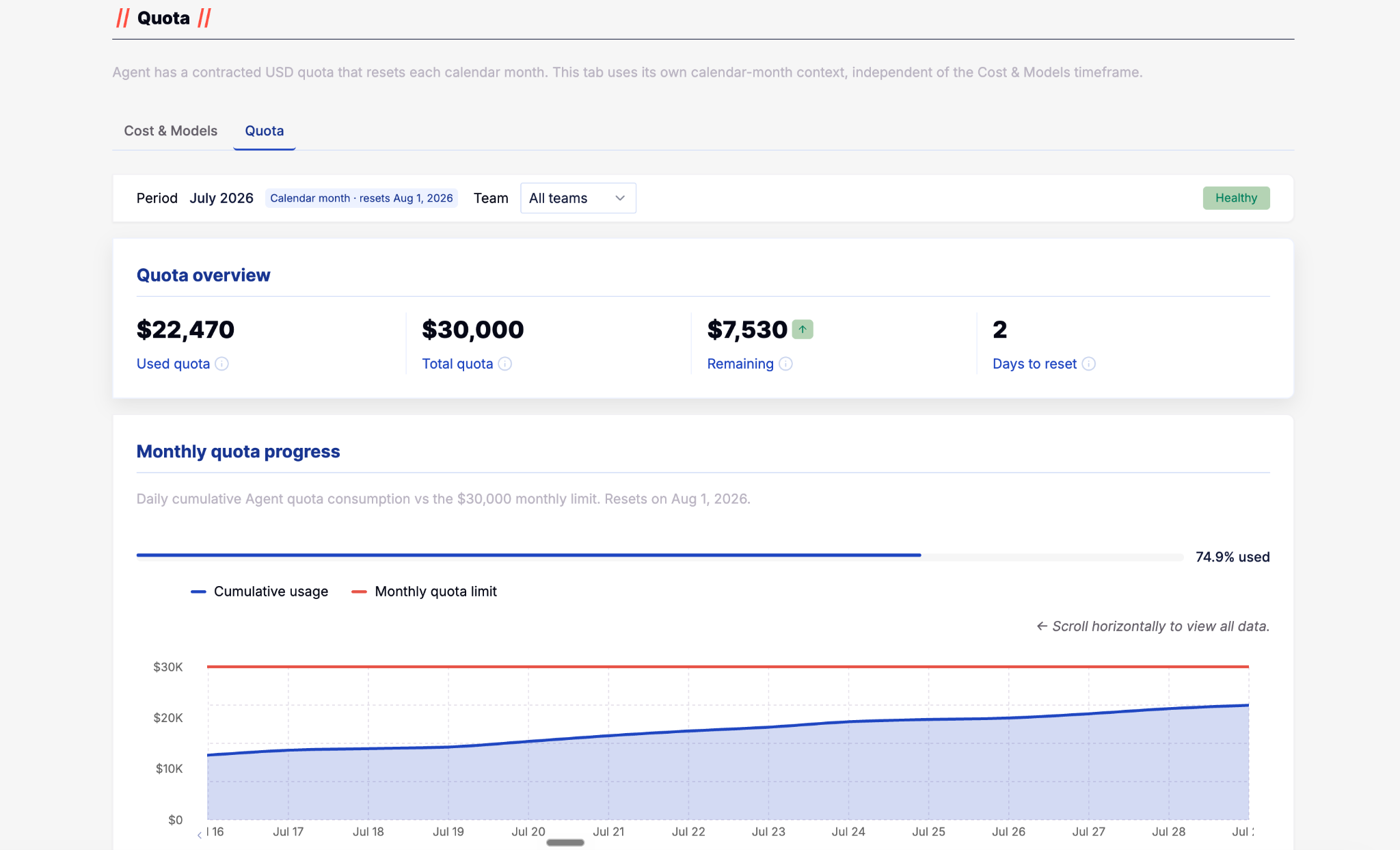
Together, these views extend Analytics from describing product activity toward helping enterprise admins make decisions about cost, efficiency, and budget risk.
The questions stayed more stable than the product.
Analytics is not a dashboard that reaches a finished state. It is a product system that reflects whatever the product itself has become.
Over time, some metrics gained importance, others became less useful, and product distinctions that once justified separate analytics became less meaningful.
The enduring part was not the dashboards. It was the questions people were trying to answer.