Design System
Creating a shared product language for Design and Engineering.
Tabnine already had products, patterns, and coded components. What was missing was a shared foundation that connected design decisions with production implementation.
Executive summary
- The problem
- Design and Engineering were working with inconsistent components, naming, states, and sources of truth.
- My contribution
- I initiated the system, audited the existing product, defined shared foundations, connected Figma to production components, and worked with Engineering to make the system usable across teams.
- The outcome
- A shared product language supported by approximately 60 production components, 69 Code Connect mappings, around 150 variables, and used by four engineering teams.
01
The challenge
I initiated Tabnine’s Design System after noticing that Design and Engineering were often solving the same interface decisions separately.
Components existed in both Figma and code, but there was no reliable connection between them. Buttons, tables, forms, feedback states, and layout patterns were often solved screen by screen. Similar patterns behaved differently, several versions of the same component existed, and the handoff process required repeated clarification.
The challenge was not visual inconsistency alone. Teams lacked a shared way to define, document, and implement product patterns consistently.
- 01Figma and code were disconnected.
- 02Similar patterns behaved differently across products.
- 03Handoff required repeated clarification.
02
Understanding what already existed
Before creating anything new, I reviewed existing product patterns, Figma files, and coded components to understand what was already in use, where design and implementation diverged, and which patterns were duplicated or competing.
The audit helped distinguish what needed to be consolidated in Figma from what already existed in production.
Duplicate components
Similar controls existed multiple times, in Figma and in code, with subtle differences.
Inconsistent states
Hover, focus, disabled, loading, and error behaviors weren’t standardized.
Missing documentation
Component intent relied on team knowledge rather than accessible documentation.
Fragmented ownership
There was no clear ownership model for reviewing and introducing new patterns.
Process
Closing the gap between design and code.
I first built the Design System in Figma, expecting implementation to follow. But product delivery continued to take priority, and only parts of the system reached production.
That changed the problem. The challenge was no longer designing the system — it was connecting it to the way Engineering actually built the product.
Phase 01
Building the foundation
01
Design System foundations
Created tokens, variables, reusable component patterns, and shared design foundations in Figma.
02
Structured for implementation
Defined naming, variants, states, and documentation so the system could move beyond the design file.
Phase 02
Building the bridge
03
Implementation remained partial
Product delivery continued to take priority, so only parts of the designed system were reflected in production.
04
Expanded into the engineering workflow
I used Claude Code and shadcn/ui as a technical foundation to build the missing production component layer, while working closely with Engineering.
Phase 03
Connecting the system
05
Engineering review and merge
Engineering reviewed the implementation, suggested improvements, and merged the final work into the shared repository.
06
Connected Design to Production
Mapped Figma components directly to their production React sources using Code Connect.
Final Outcome
One connected system
Design and Engineering could work from the same shared reference — from component definition through production implementation.
03
Building the shared foundation
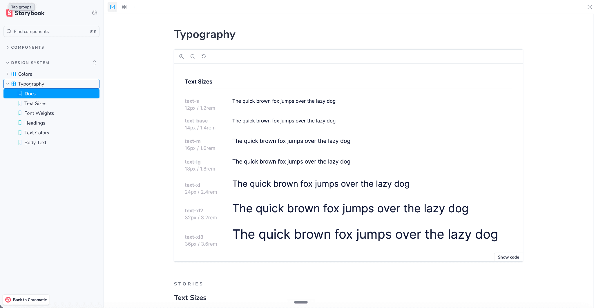
I created shared foundations for typography, color, spacing, radius, elevation, interaction states, naming, and component structure.
The Figma library became more structured and predictable, supported by approximately 150 published design variables.
- 01
Foundations
Tokens for color, typography, spacing, radius, and interaction states.
- 02
Reusable components
Buttons, inputs, feedback, and complex enterprise patterns.
- 03
Documentation
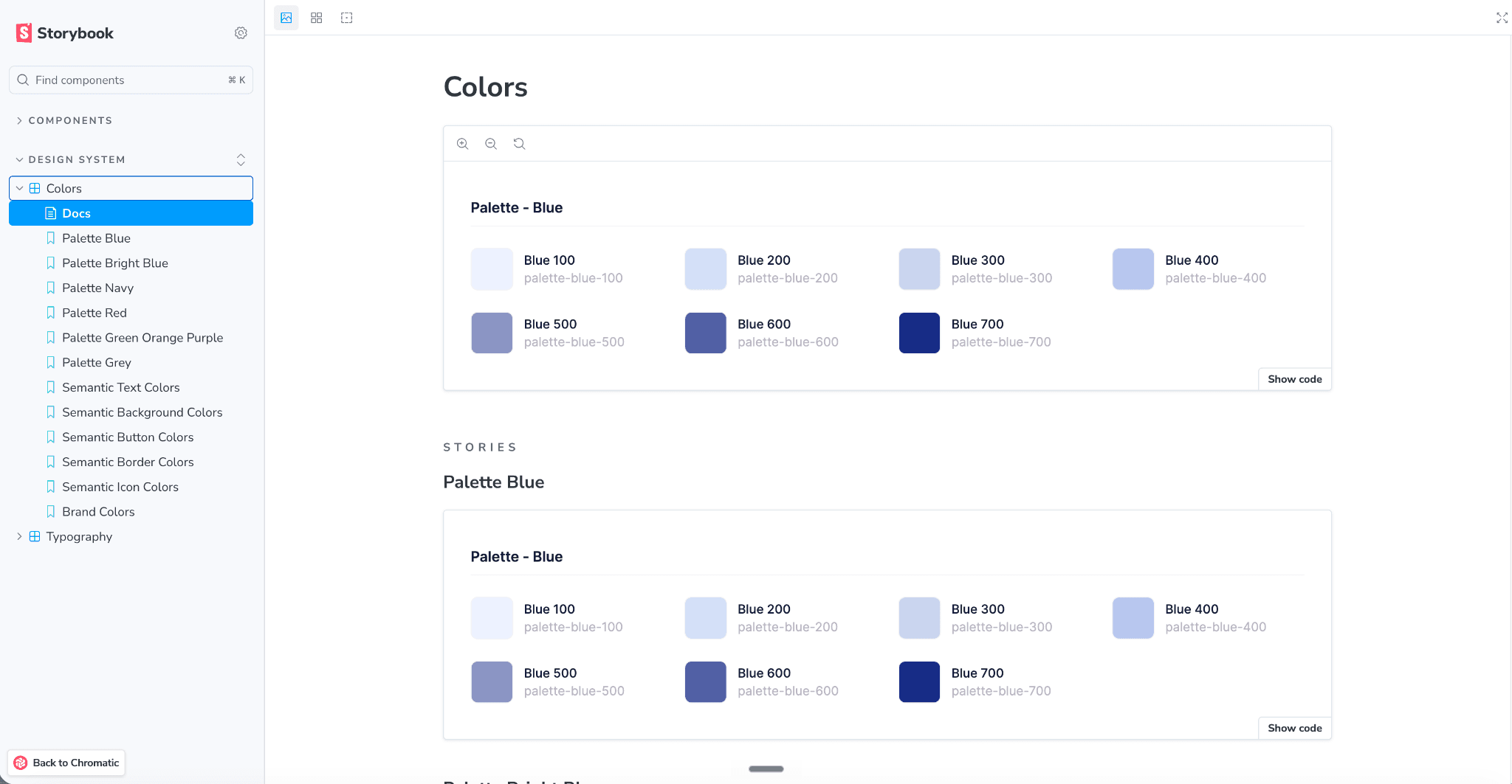
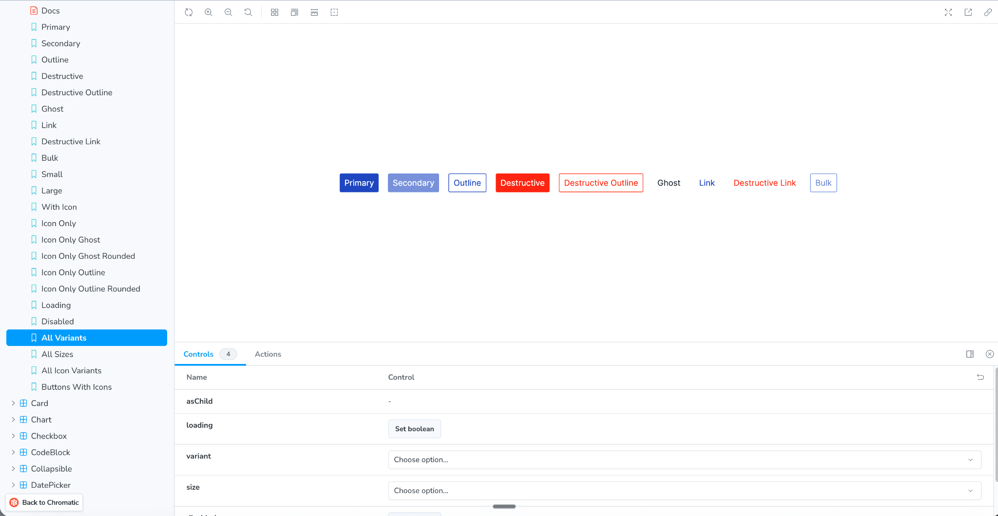
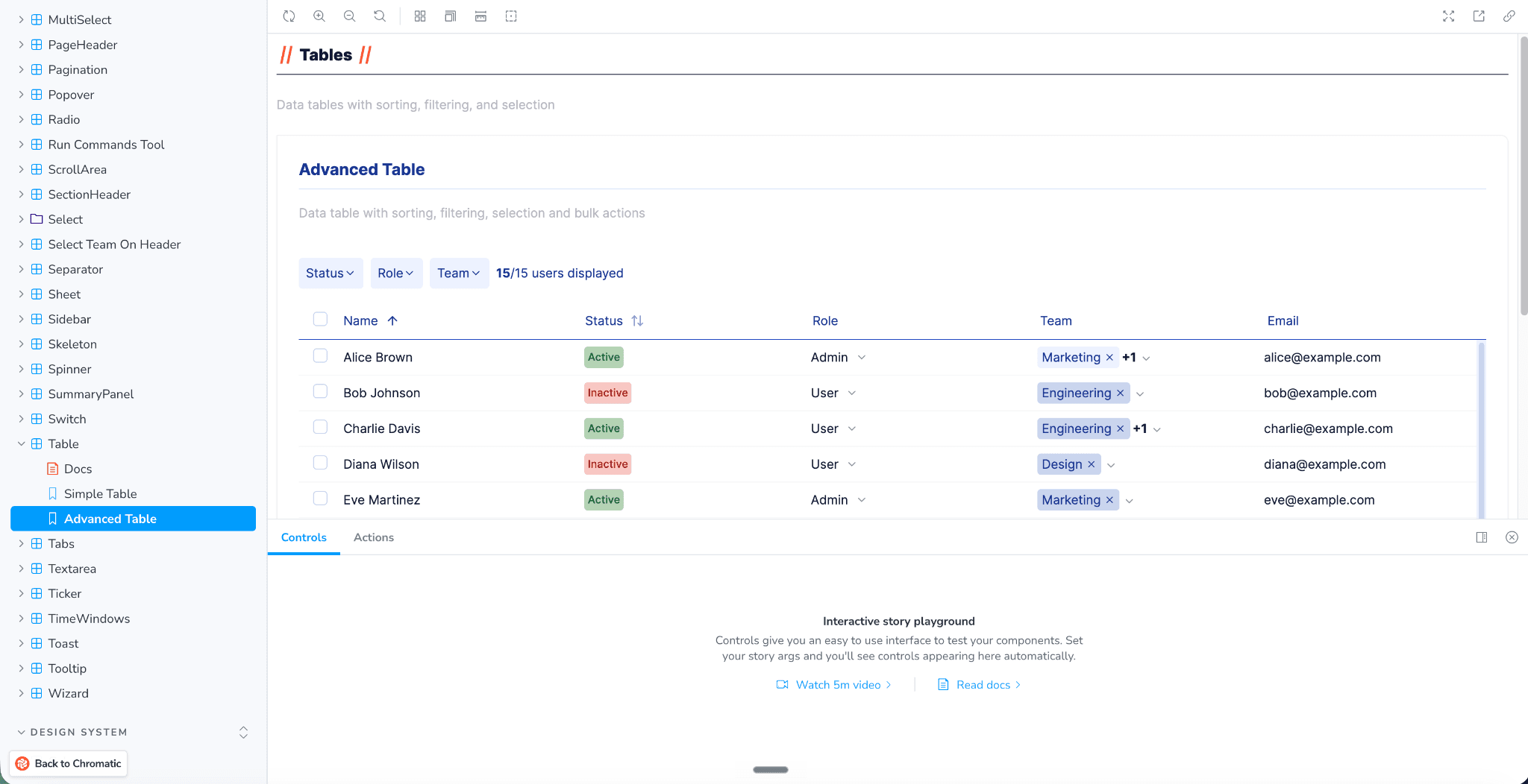
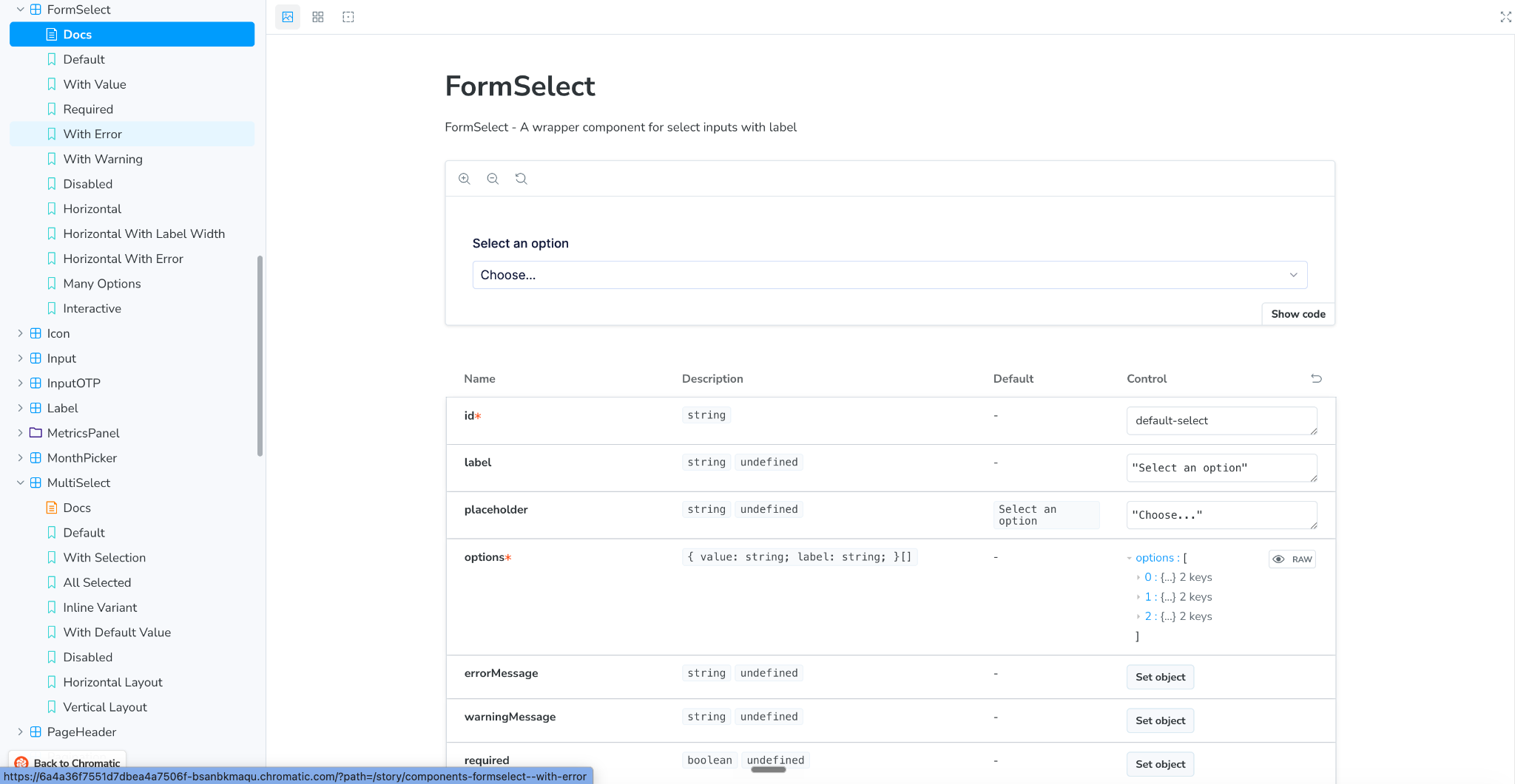
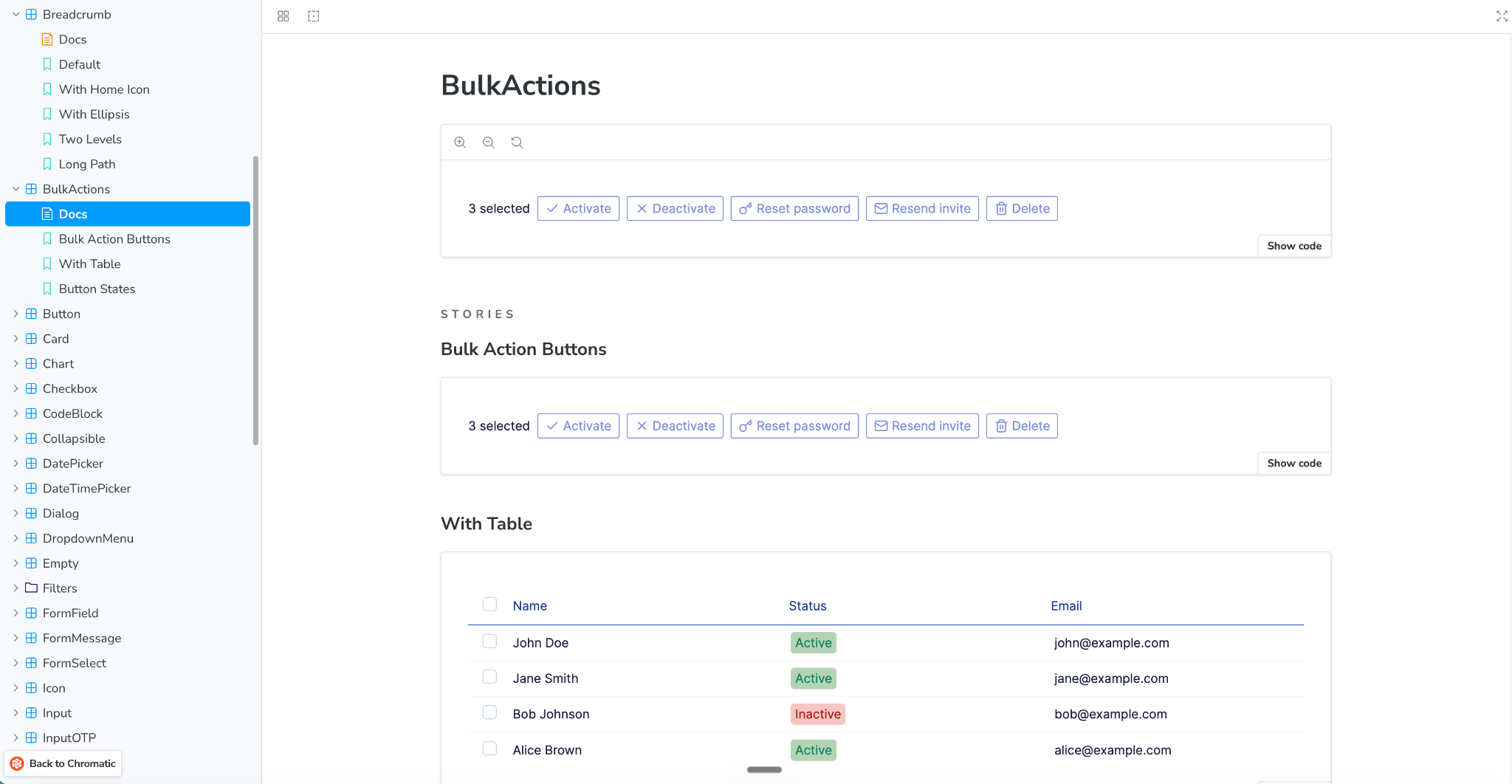
Storybook documentation with inspectable variants, states, and usage guidance.
- 04
Code implementation
React components connected to their Figma counterparts.
04
Connecting design and implementation
I began working directly with the engineering workflow rather than treating implementation as a separate handoff.
The goal was never to become an engineer. It was to remove the gap between design intent and production.
Using Claude Code and shadcn/ui as a technical foundation, I built the missing production component layer and adapted it to Tabnine’s design system. Engineering reviewed the work, suggested improvements, helped where needed, and merged the final implementation.
Once the coded library was in place, I mapped the Figma components to their production .tsx sources with Code Connect and created a Figma library containing only production-connected components.
That closed the loop between design, implementation, and documentation.
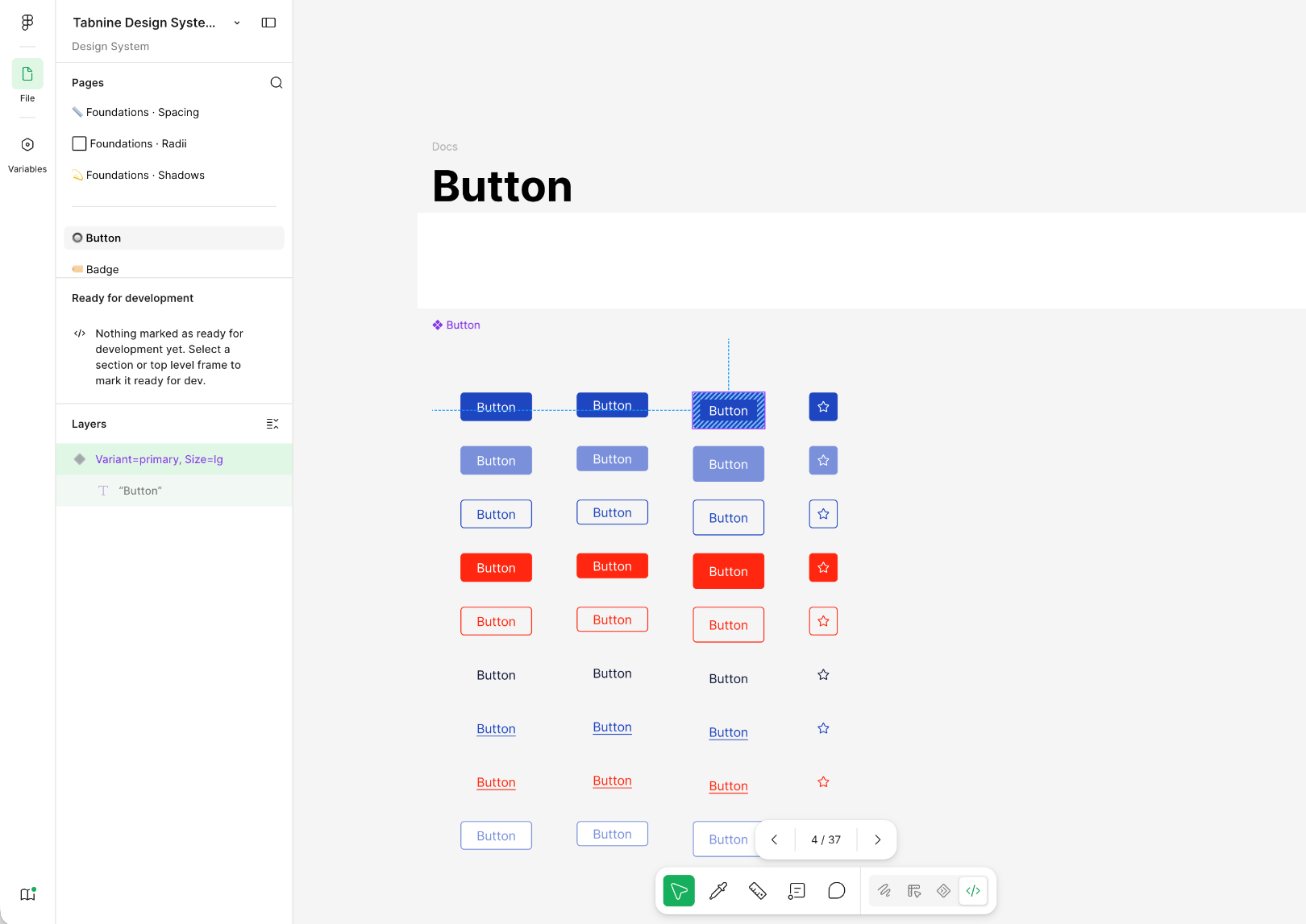
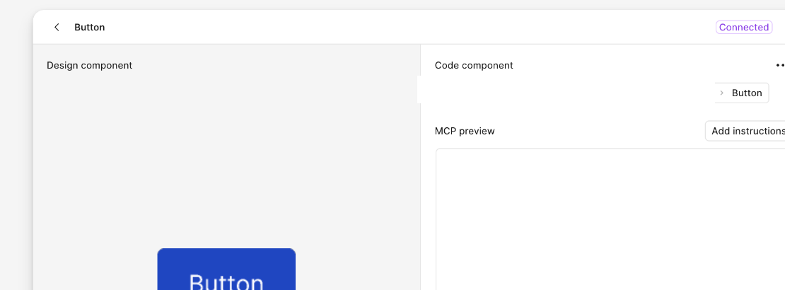
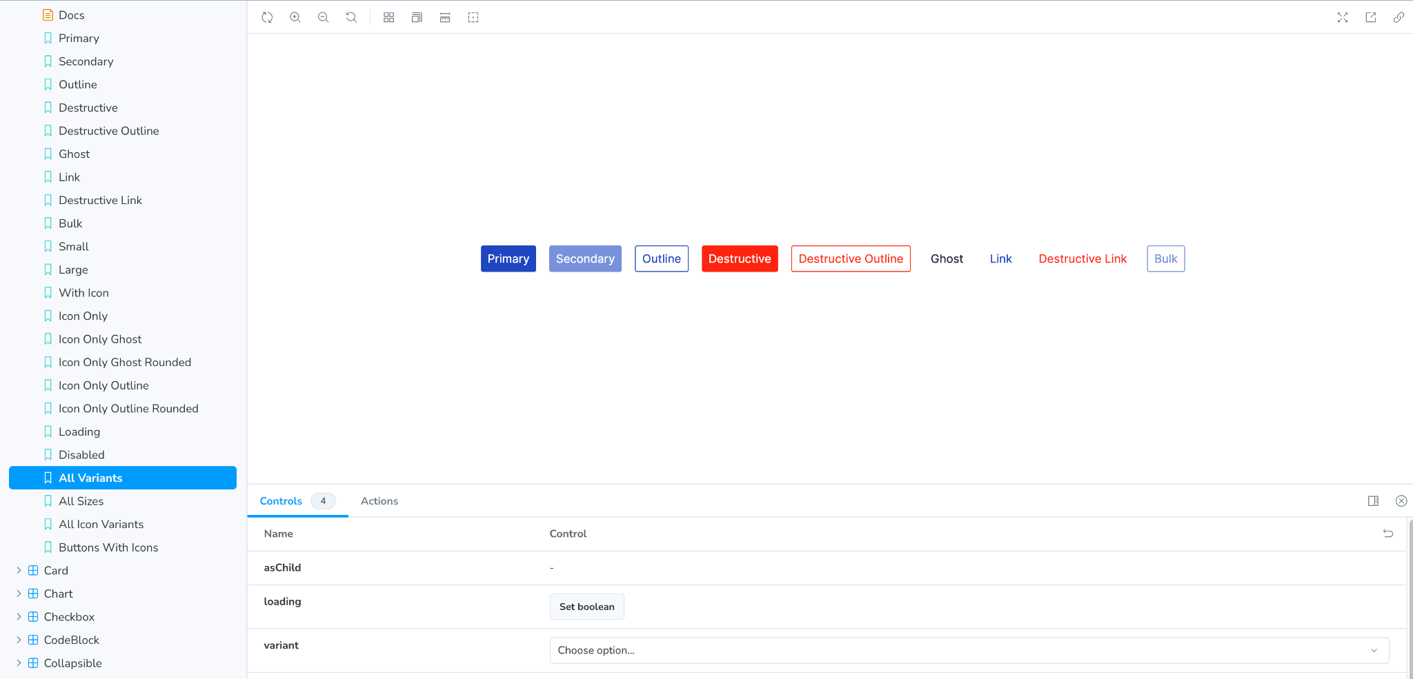
How a component connects across design, implementation, and documentation.
01
Design component
Shared component and variants in Figma.
02
Connected implementation
The design component mapped to its code implementation through Figma Code Connect.
03
Documented behavior
The component, variants, controls, and states documented in Storybook.
05
Driving adoption
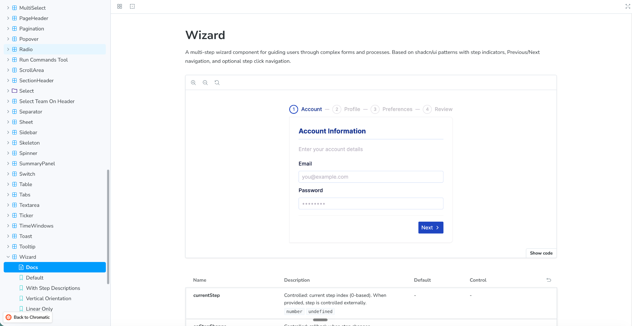
A Design System only creates value when teams can actually use it. I focused on high-friction patterns, made production status visible, worked directly with Engineering during review, and created a clearer path for teams to reuse and extend shared components.
System capabilities
- Shared foundations and design variables
- Reusable components and states
- Storybook documentation
- Code Connect mappings
How it supported teams
- A clearer design-to-engineering handoff
- Shared patterns instead of one-off solutions
- A visible connection between design intent and production
- A clearer path for reviewing and extending shared components
06
Impact and learning
Scale of the system
- ~60
- Production components
- 69
- Code Connect mappings
- ~150
- Published design variables
- 4
- Engineering teams using the shared foundation
These figures describe the current scale of the shared library and repository, not adoption across every product surface.
Operational effect
- Reduced repeated clarification during handoff
- Made the relationship between Figma and production more visible
- Created a shared path for extending components across teams
A Design System is not only a component library. It is a shared product and engineering practice that needs documentation, ownership, maintenance, and adoption.
This project changed how I think about the role of Product Design. When the system was not reaching production, I moved closer to implementation — not to replace Engineering, but to help close the gap between design intent and the way the product was actually built.
The strongest lesson was that a Design System is not finished when the library is complete. It becomes valuable when teams can use it as a shared foundation for designing, building, reviewing, and extending the product together.