Redesigning an Irrigation Controller for Field Operators
Turning an inherited irrigation-controller redesign into a clearer, field-ready experience — using field research to validate deeper workflow problems before production.
- Complex Systems
- Usability Research
- Field UX
- Tablet Controller
- Operational Workflows
Executive summary
- The problem
- The controller interface was being visually updated, but its workflows still did not reflect how technicians operated in real field conditions.
- My contribution
- I inherited the project midstream, identified that the problem extended beyond visual polish, led field research with technicians, and translated the findings into a revised product direction.
- The outcome
- The research validated the key usability risks, created leadership alignment, and influenced the product direction before production.
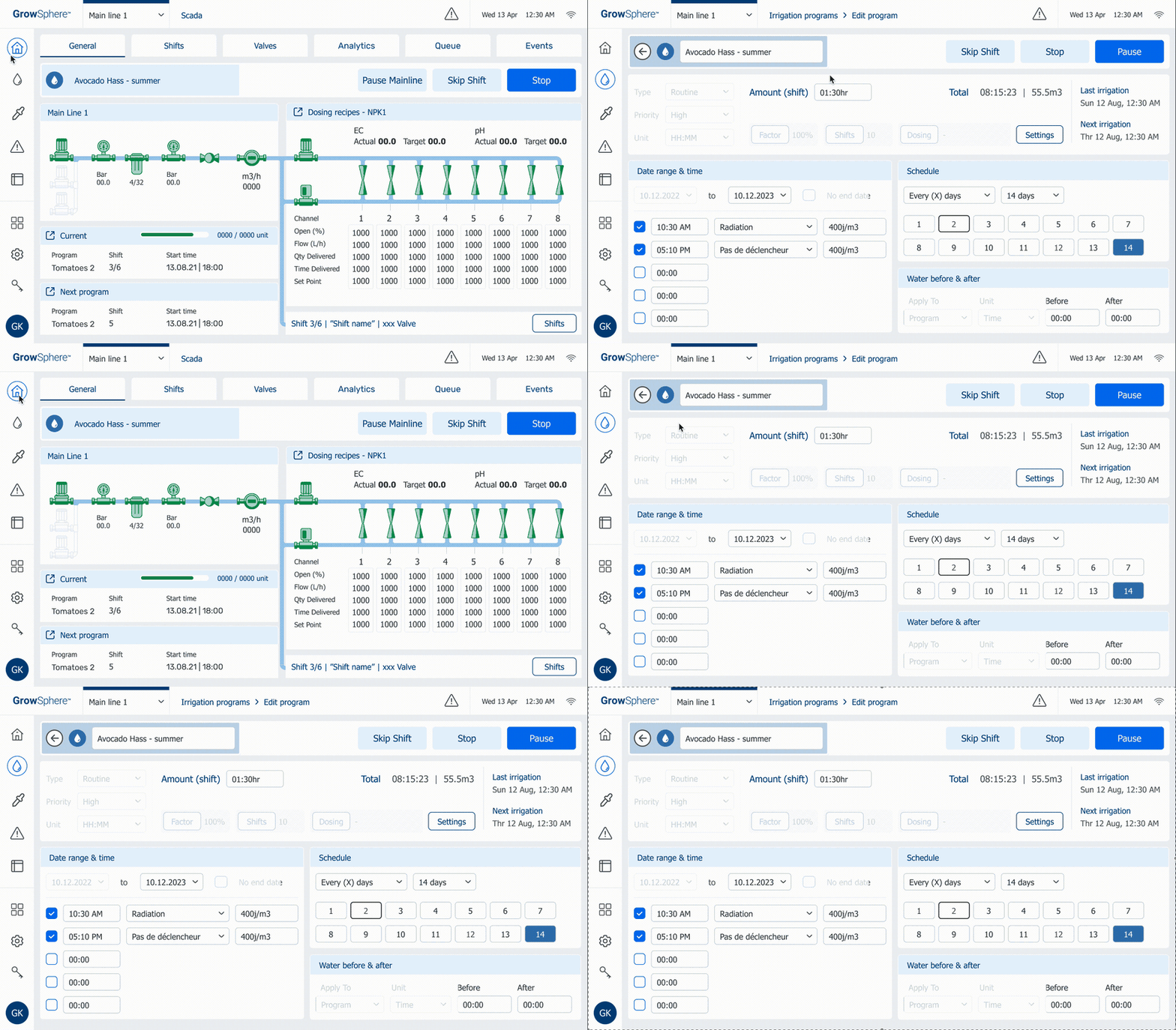
I joined the project about a month after it had started, inheriting an existing direction rather than beginning from a blank slate.
What initially looked like a visual update quickly revealed deeper workflow problems. Core actions such as configuring irrigation schedules, understanding system states, and managing programs and shifts were harder to interpret than the interface suggested.
Instead of treating those concerns as design polish, I used field research to test whether they reflected real user problems — and the findings helped create momentum for broader product changes before production.
The challenge wasn’t to modernize the interface. It was to make a complex operational system understandable in real field conditions.
Irrigation configuration involves multiple levels of hierarchy and state. Technicians need to understand what is scheduled, what is currently active, and what can be changed — often while troubleshooting live systems. The interface had to work under real field conditions, not only in a clean design review, because errors or ambiguity in the flow could affect real irrigation operations. The engineering setup also limited some tablet-native interaction patterns, so the redesign had to balance field usability with technical constraints.
Real field constraints shaped every decision.
- Outdoor and daylight use — needs strong contrast and quick orientation.
- Touch interface used with gloves or dirty fingers — needs large targets and clear affordances.
- Limited support for swipe gestures, complex collapse/expand patterns, and endless scrolling.
- Slow or unreliable response per click in some flows — fewer, more decisive taps preferred.
- Had to stay aligned with the broader GrowSphere product without copying desktop patterns one-to-one.
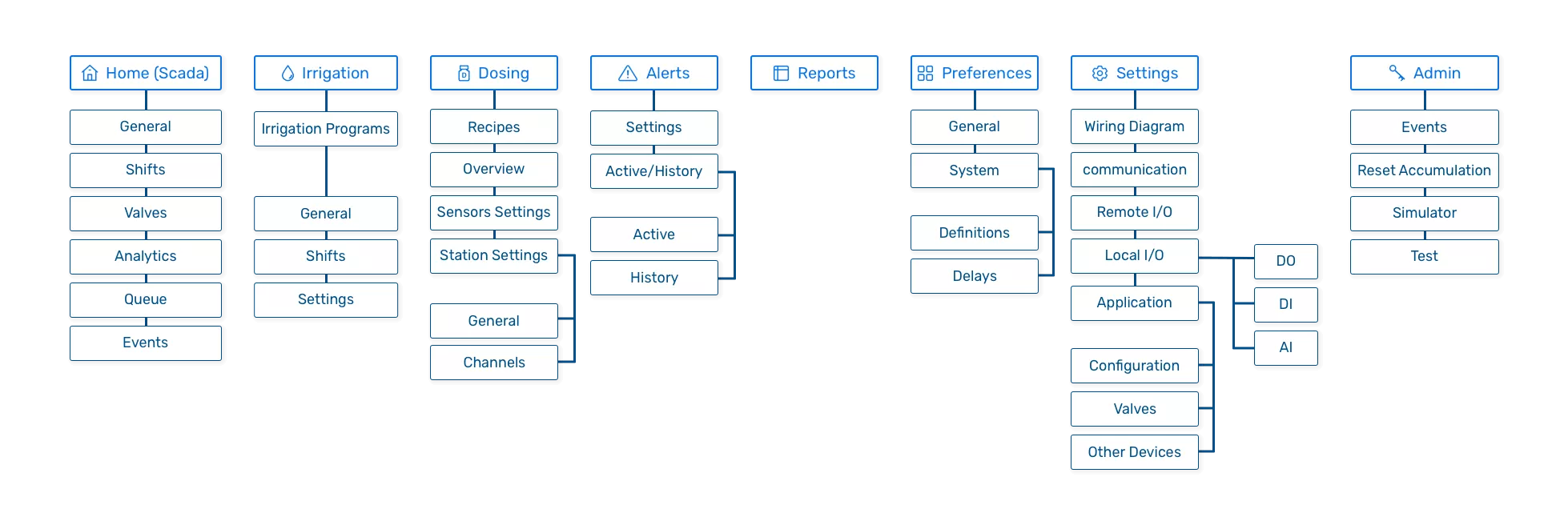
What we set out to do.
Four goals framed the redesign.
- 01
Make irrigation scheduling easier to understand and modify.
Reduce ambiguity in one of the controller’s most frequent operational tasks.
- 02
Clarify the relationship between programs, shifts, timing, and system state.
Make hierarchy and status easier to understand at a glance.
- 03
Design interactions that remain understandable in real field conditions.
Prioritize clear feedback, strong hierarchy, and reliable touch interactions.
- 04
Validate the redesigned workflows with technicians and installers who would actually use them.
Test design assumptions against real field behavior before production.
How the work moved.
Understand the inherited product.
I reviewed the existing controller, workflows, terminology, and visual direction to understand both what had already been decided and where users could encounter friction.
Identify workflow risks.
As I redesigned the core flows, I found issues that went beyond visual consistency — including discoverability, scheduling logic, system states, and the relationship between programs and shifts.
Validate in the field.
At Netafim’s global summit, I tested the workflows with technicians and installers. Several issues I had identified independently surfaced again through user behavior and feedback.
Turn findings into product direction.
The research gave the team stronger evidence for changes that had previously been design concerns, helping move the conversation from visual refinement toward workflow improvement before production.
What we heard from field technicians.
I had already identified several usability concerns while redesigning the workflows, but design intuition alone was not enough. The global summit created an opportunity to test those assumptions directly with technicians and installers who work with irrigation systems in the field.
The important outcome was not that research “confirmed the design.” It gave the team evidence that several issues were product problems worth addressing before production.
Finding 01: Removing a shift was difficult to discover.
Users could create and configure shifts, but removing one was much less obvious. The action did not match the importance or frequency of the task, creating unnecessary friction in schedule maintenance.Finding 02: Interval vs. weekday scheduling caused confusion.
Users did not always understand whether they were defining a repeating interval or specific days of the week. The scheduling model needed to make the distinction explicit rather than relying on users to infer it from controls.Finding 03: Controls did not always communicate their effect.
Some interactions required users to understand the system before the interface explained what would happen. Controls needed clearer labels, states, and feedback.Finding 04: Color alone was not enough to communicate status.
Users needed to understand irrigation state quickly in field conditions. Status therefore could not rely only on color; it needed supporting text and consistent visual treatment.Finding 05: Program and shift status represented different levels.
A program could have one overall state while individual shifts inside it had another. Treating them as the same type of status created ambiguity, so the redesigned hierarchy needed to make those levels explicit.
The calls that shaped the work.
Four decisions shaped how the Controller reads and responds in the field.
Design for the moment an alert fires.
The decision
Rebuild alert and fault surfaces around clarity of state, next action, and reversibility.
Why this mattered
Alert and fault states had to help operators understand what was happening and what action was available — fast, under pressure, in the field.
Reduce interaction depth for field reliability.
The decision
Fewer, larger, more reliable taps instead of gestures the platform could not support well.
Why this mattered
The engineering setup limited many tablet-native gestures and complex interactions, so the redesign leaned into decisive single-tap actions the platform could render fast.
Make touch states visible and readable.
The decision
Give distinct visual treatment to status, pause, resume, manual, high-flow, and uncompleted states.
Why this mattered
Usability testing showed that colour-coded status wasn't understood reliably in field conditions, and that operators frequently confused program-level and shift-level state. The redesign gave each state its own text label plus visual treatment, and separated program state from shift state with different rendering — so the read holds up outdoors, with gloves, and across two levels of state at once.
Translate shared product logic into field-first flows.
The decision
Share vocabulary with the broader GrowSphere product, while reshaping flows around field use.
Why this mattered
The broader GrowSphere ecosystem included a desktop product led by the Product Design Lead, so shared vocabulary and mental models mattered. But the Controller had to stand on its own as a field-first product: tablet interactions, live operational states, and quick troubleshooting flows could not simply mirror desktop patterns one-to-one.
The redesigned experience.
System-level redesign across dashboard, alerts, program list, program status, and analytics — responding directly to the research findings with clearer state hierarchy, more explicit alert handling, and fewer interaction dependencies in the core operational flows.
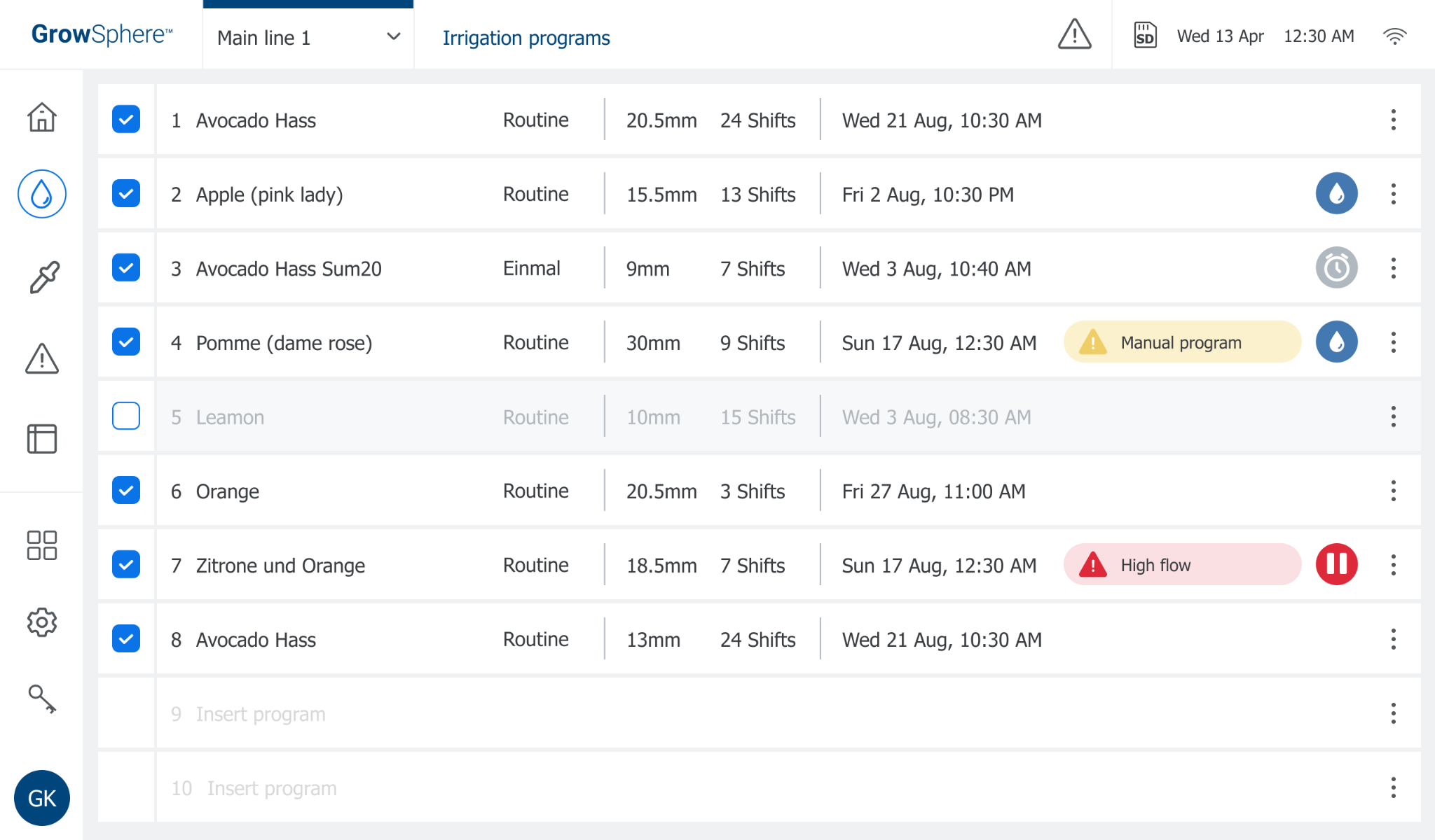
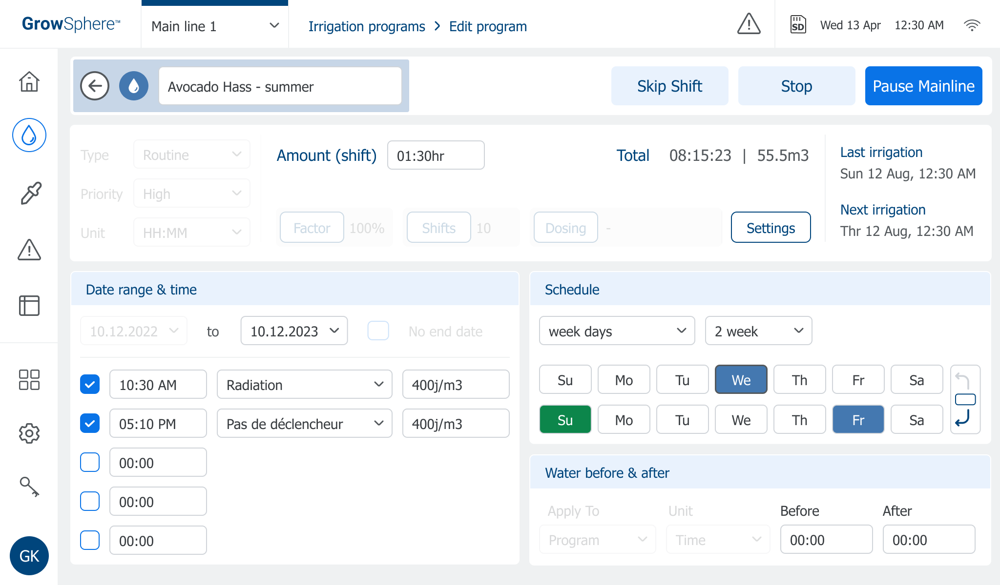
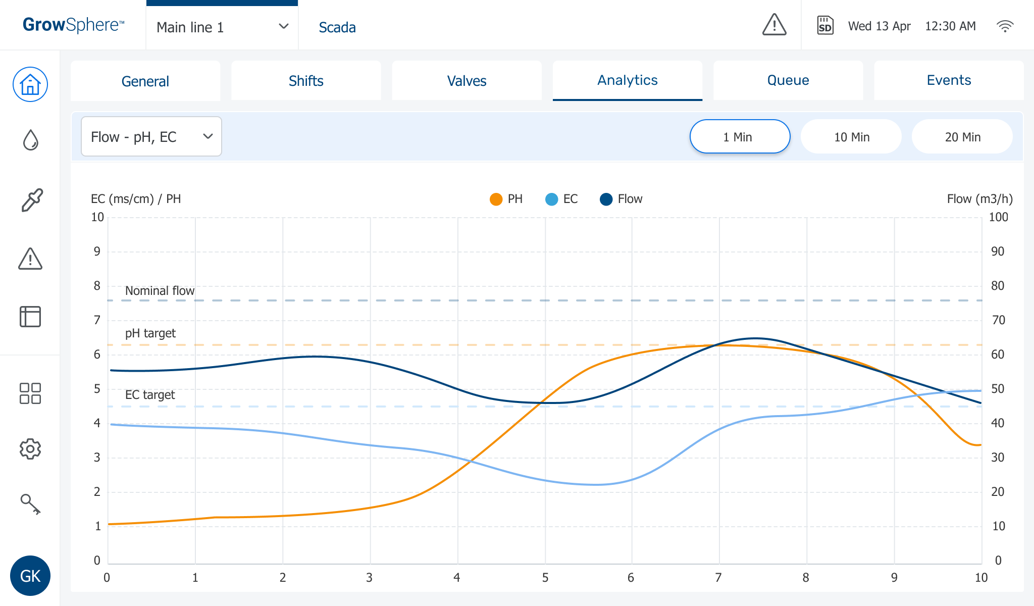
The same surface, then and now.
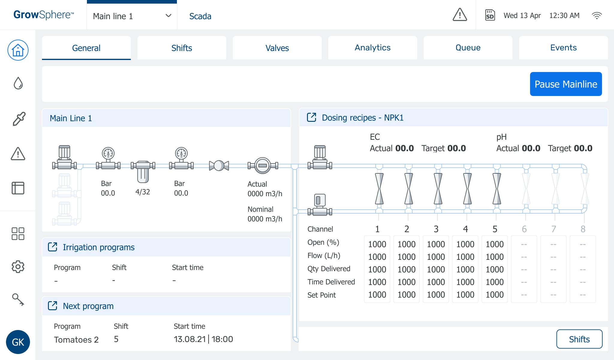
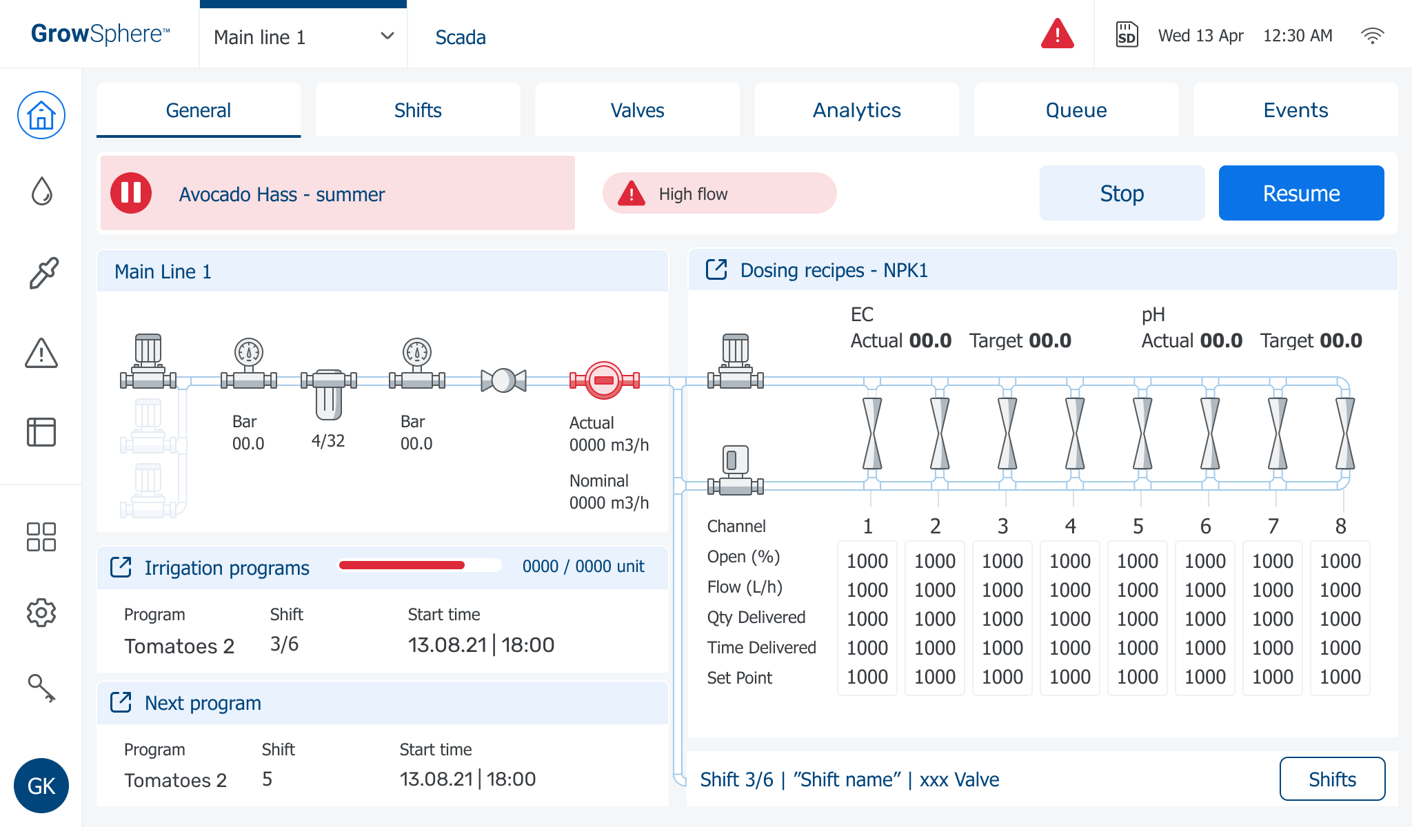
Two comparisons that show what the system-level redesign actually changed.
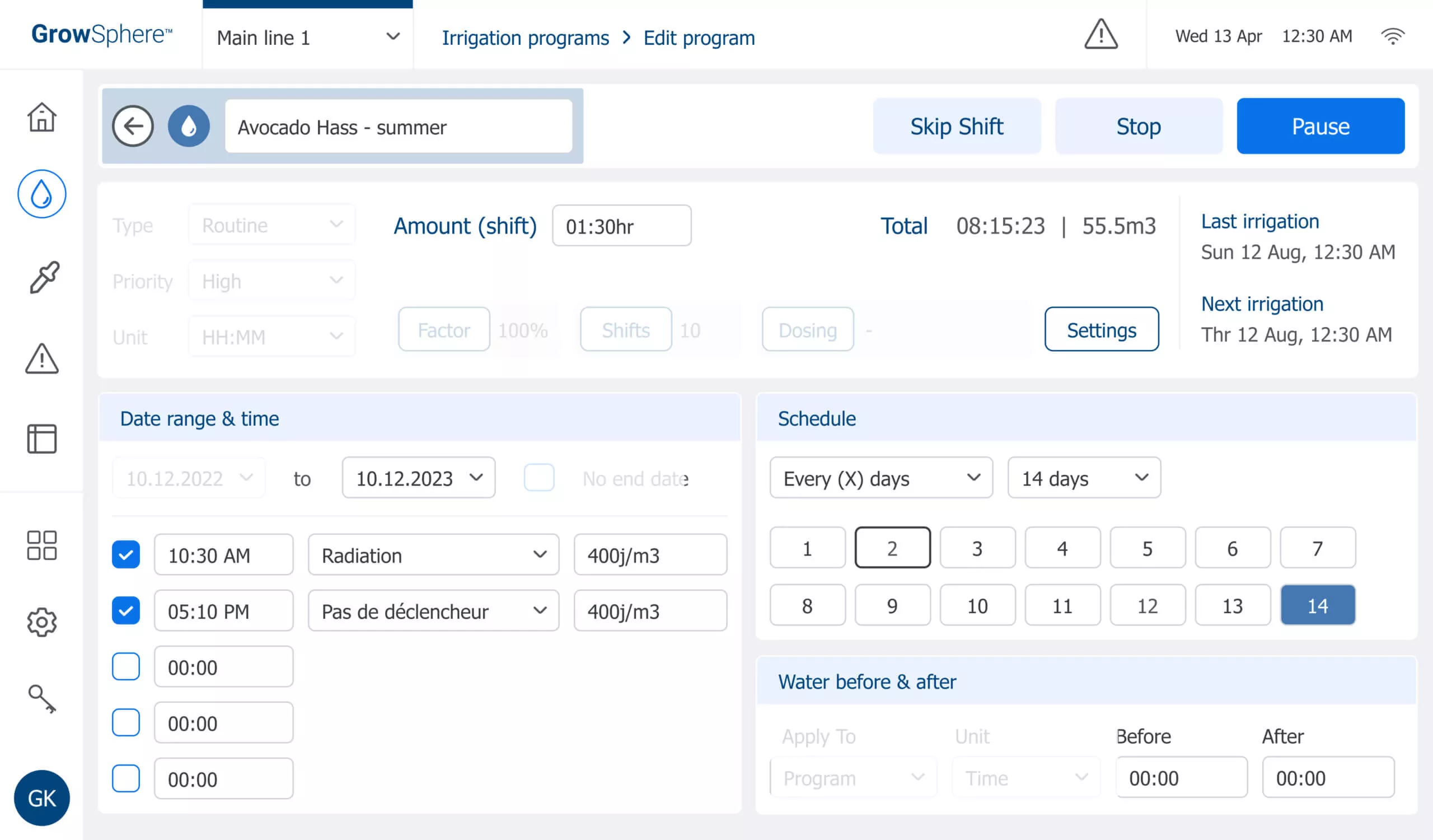
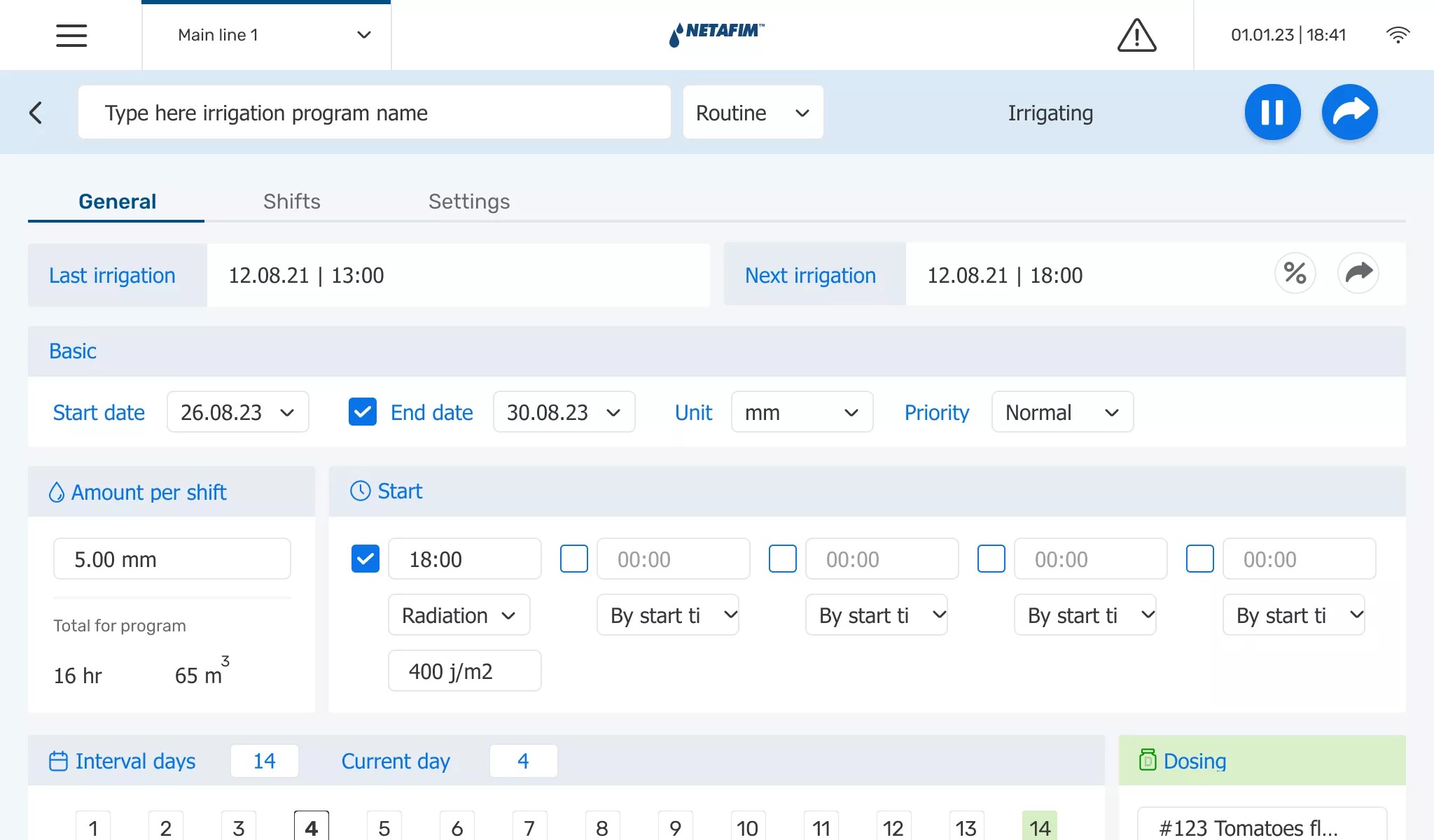 BeforeAfter
Before: dense state information was hard to scan in the field.
After: clearer hierarchy, larger targets, and a fully visible state read kept next actions in view.
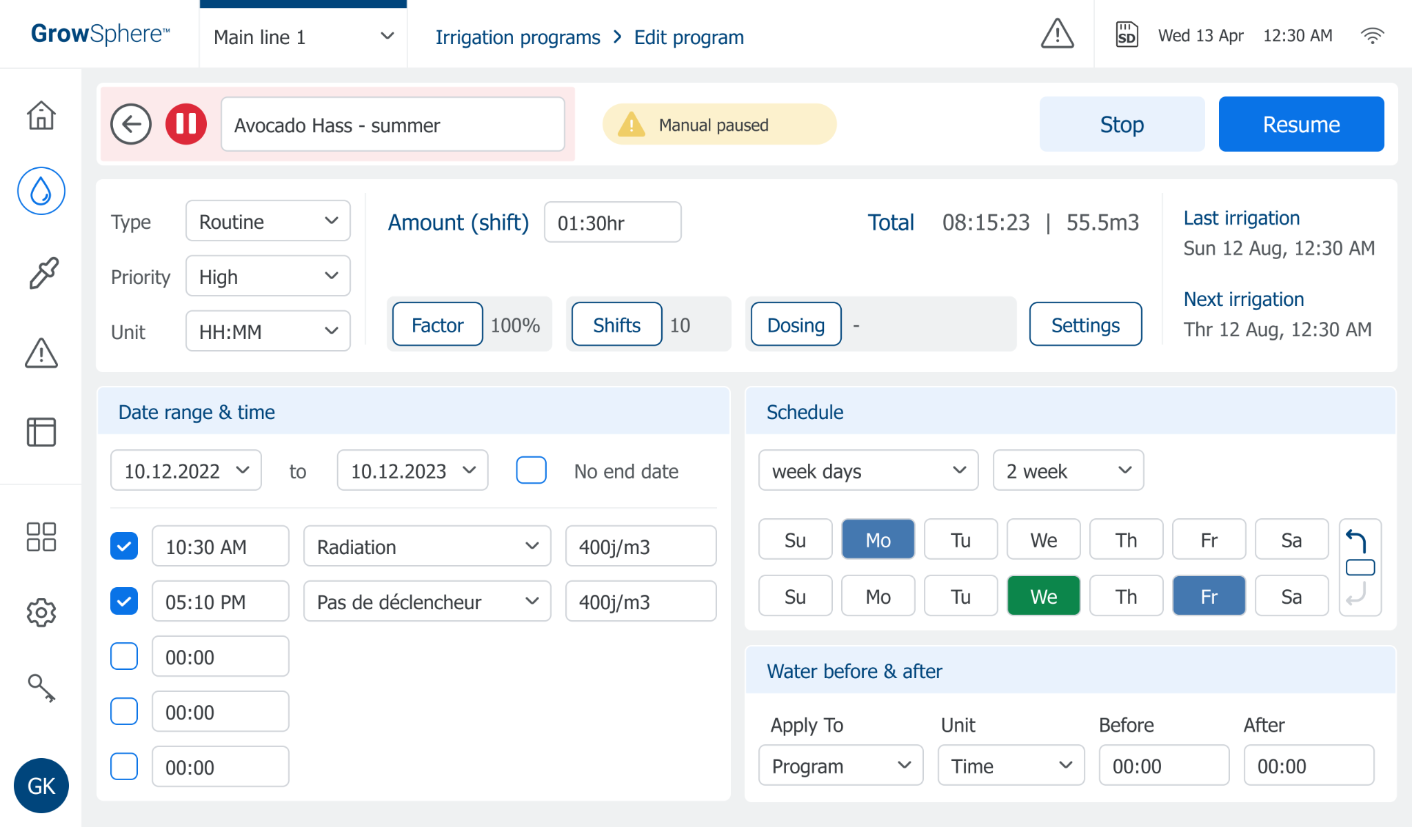
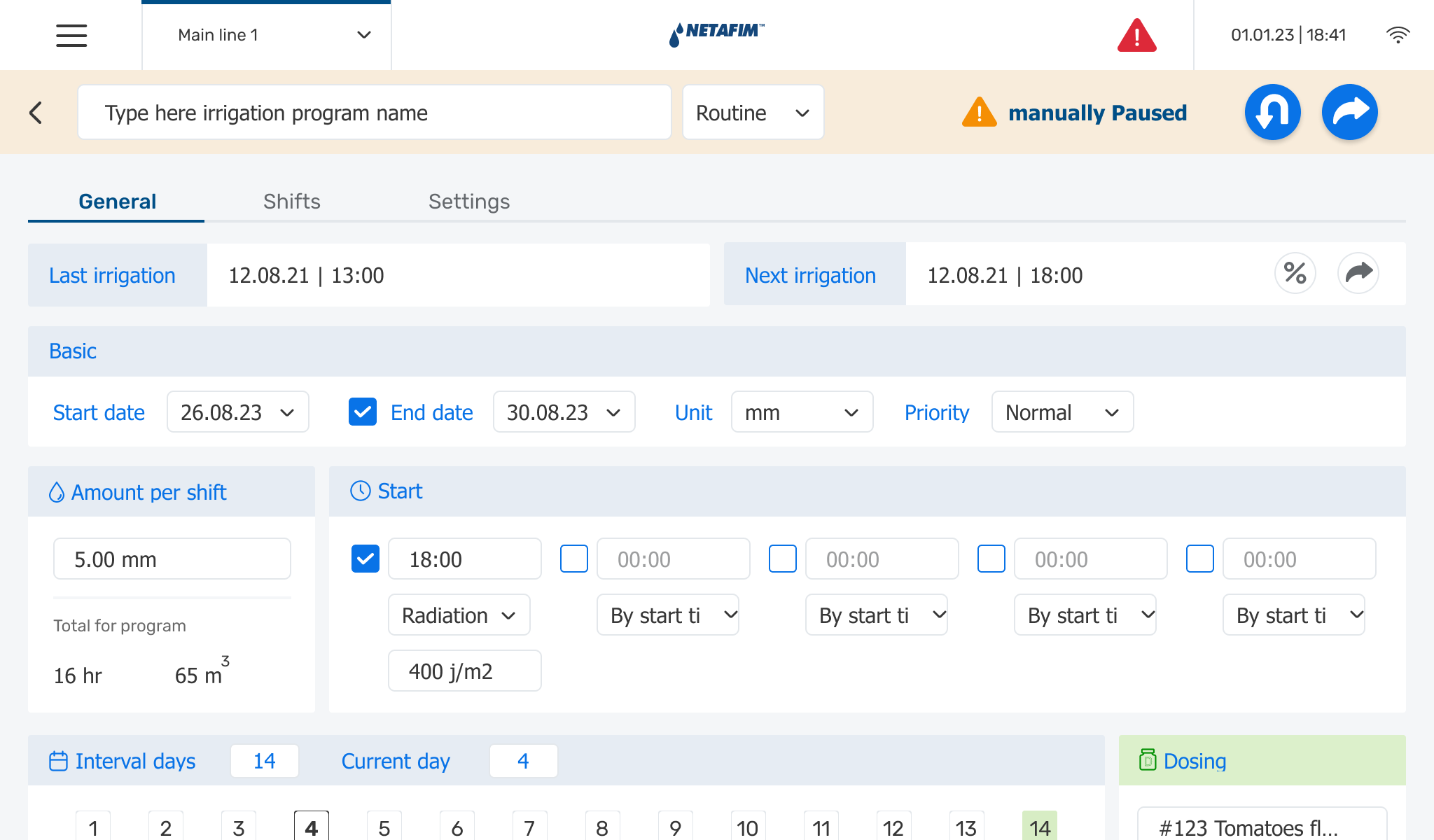 BeforeAfter
Before: pause states relied on subtle differences hard to distinguish at a glance.
After: manual and system pauses became visually distinct, with reason and resume action surfaced clearly.
Extending the Controller to mobile field actions.
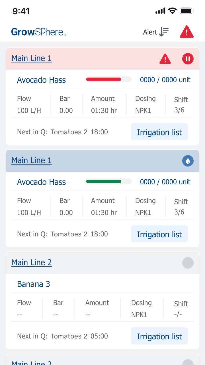
Some of the same interaction and hierarchy questions later informed follow-up work on the mobile experience. The goal was not to reproduce the controller interface at a smaller size, but to adapt the most important actions and states to a different usage context.
0102
Mobile main lines overview — alert state
Quick field awareness across active main lines, showing where attention is needed.
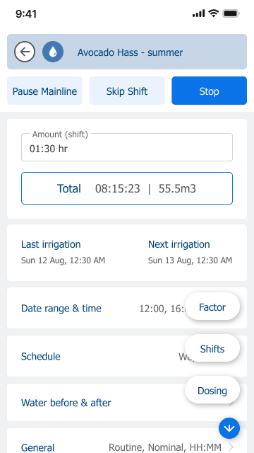
0202
Mobile program detail — active state and quick actions
Lightweight controls for actions that make sense on a phone.
A mobile follow-up focused on fast awareness, lightweight actions, and quick navigation — not recreating the full tablet workflow.
What changed.
When technicians independently raised the same concerns I had identified, the design recommendation became a product decision supported by leadership. The redesign gave the product team a clearer, validated direction before production.
Outcomes
- Field research validated usability concerns that had initially emerged through design work, giving the team stronger evidence for broader product changes.
- The project moved beyond a visual refresh toward clearer scheduling, hierarchy, state communication, and field-ready interactions.
- Programs and shifts became easier to distinguish as separate levels of configuration and system state.
- Research with technicians and installers helped align Design and Product around issues worth addressing before production.
- The tablet work also informed later mobile follow-up, where the same hierarchy and field-context questions had to be adapted to a smaller surface.
Looking back.
This project reinforced that design concerns become much more powerful when they can be connected to real user behavior.
I had identified many of the workflow problems before testing, but field research changed the conversation. What had initially been design concerns became shared product evidence.
It also reinforced that designing for constraints is not a compromise. The hardware, engineering setup, and field context were part of the product problem itself.
The most important outcome was not simply validating a redesign. It was using research to create product momentum around problems that were worth solving before production.