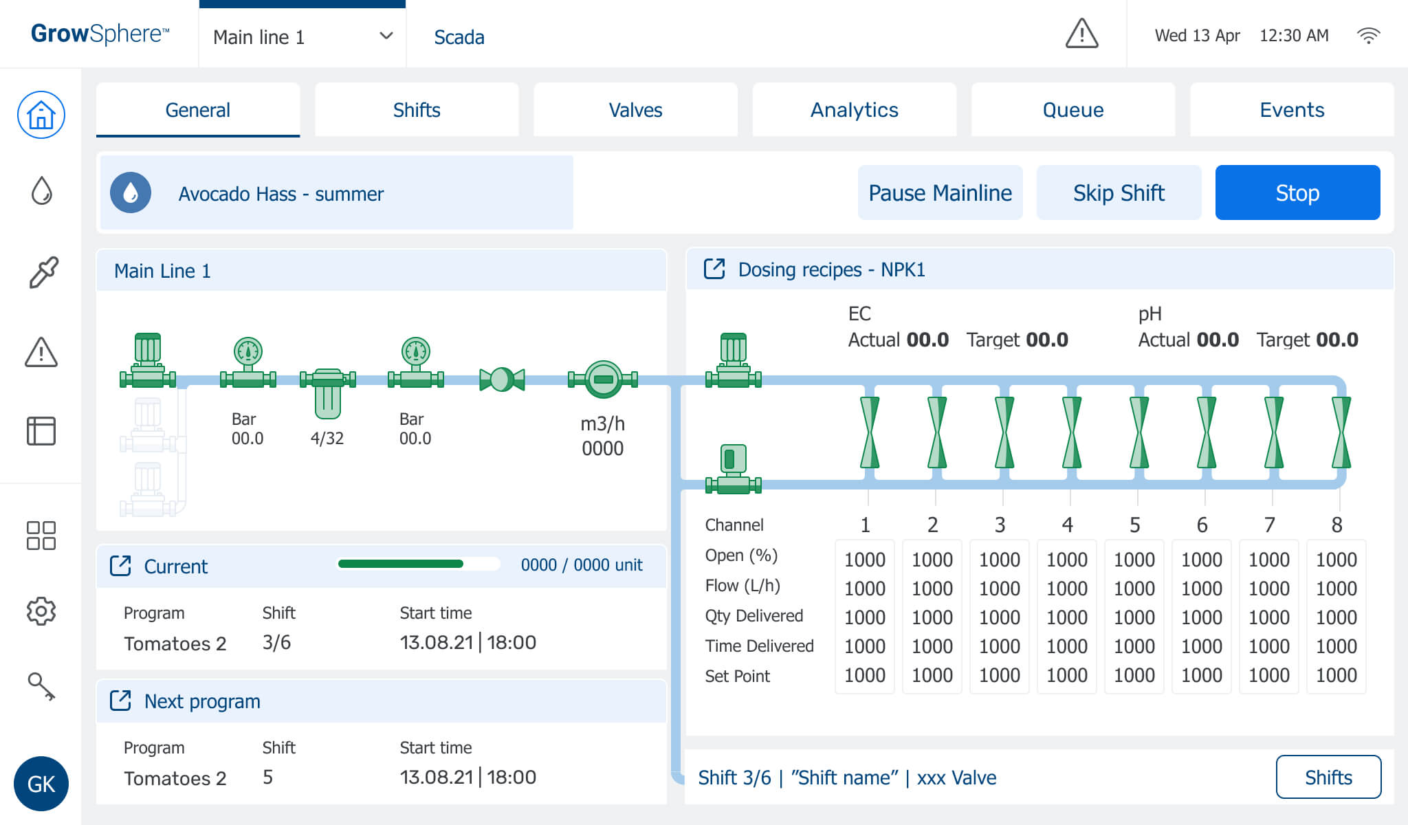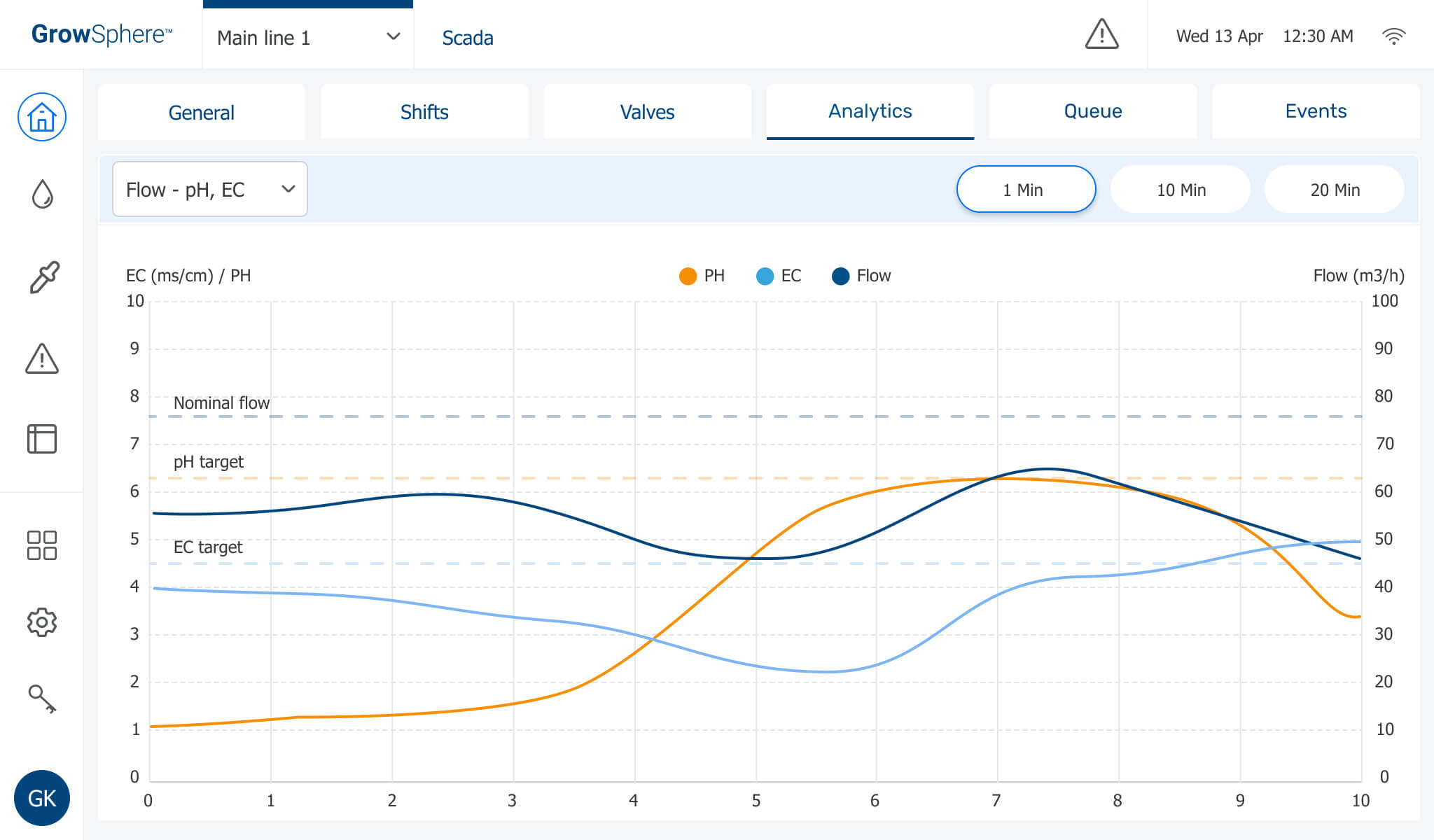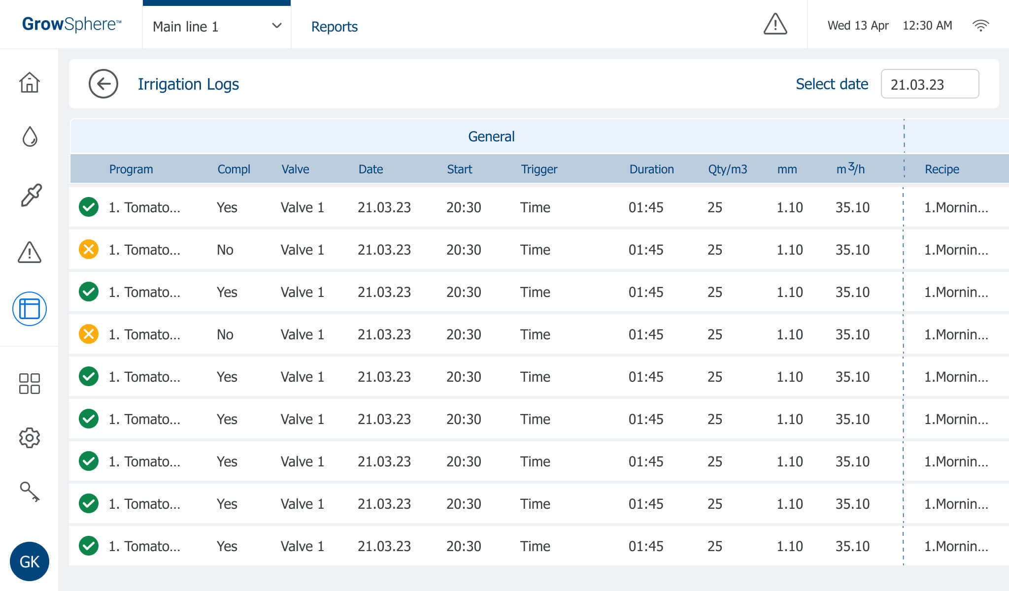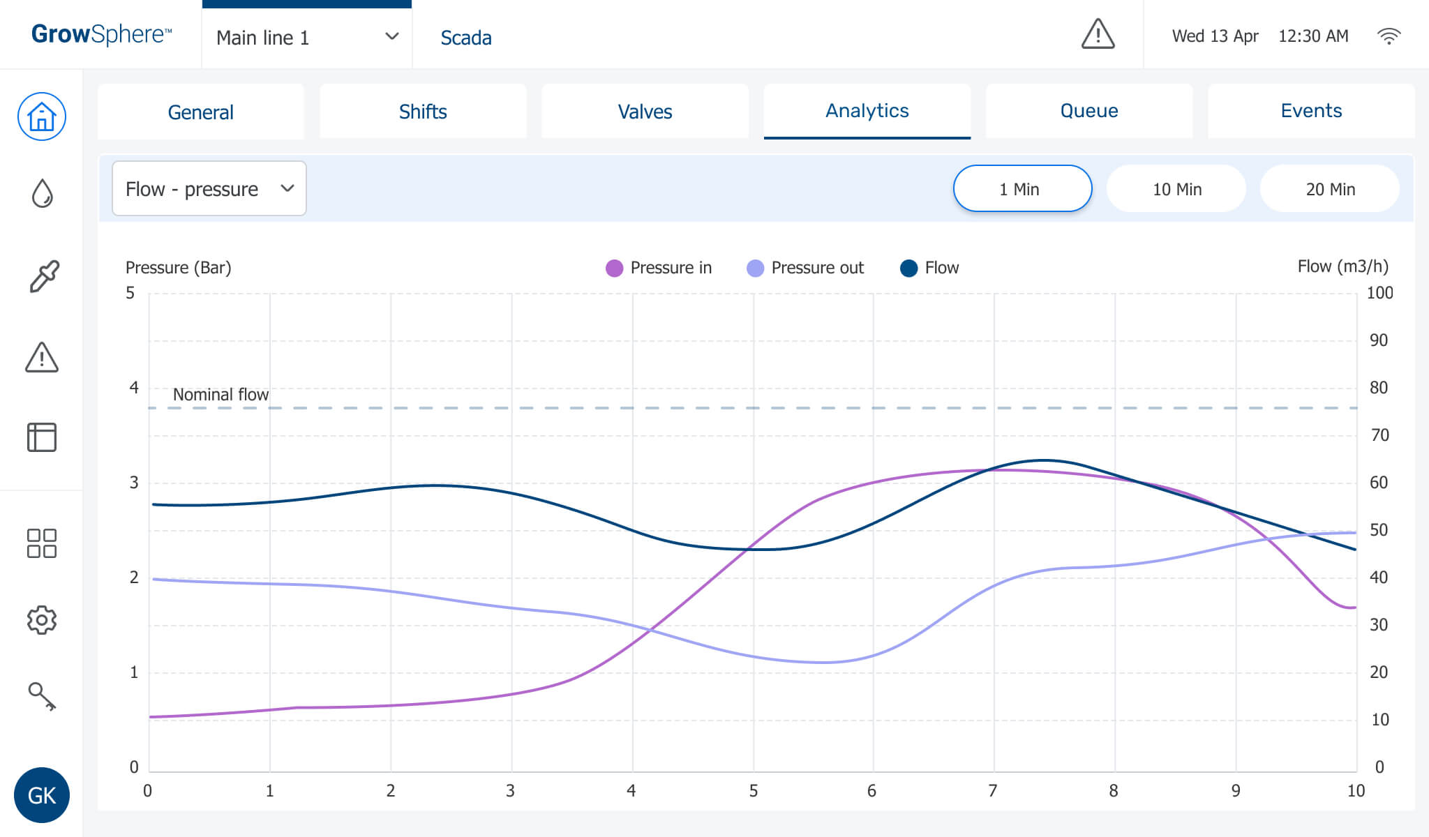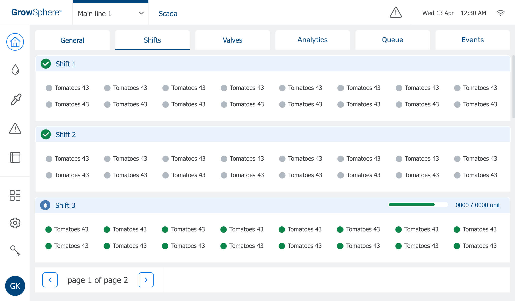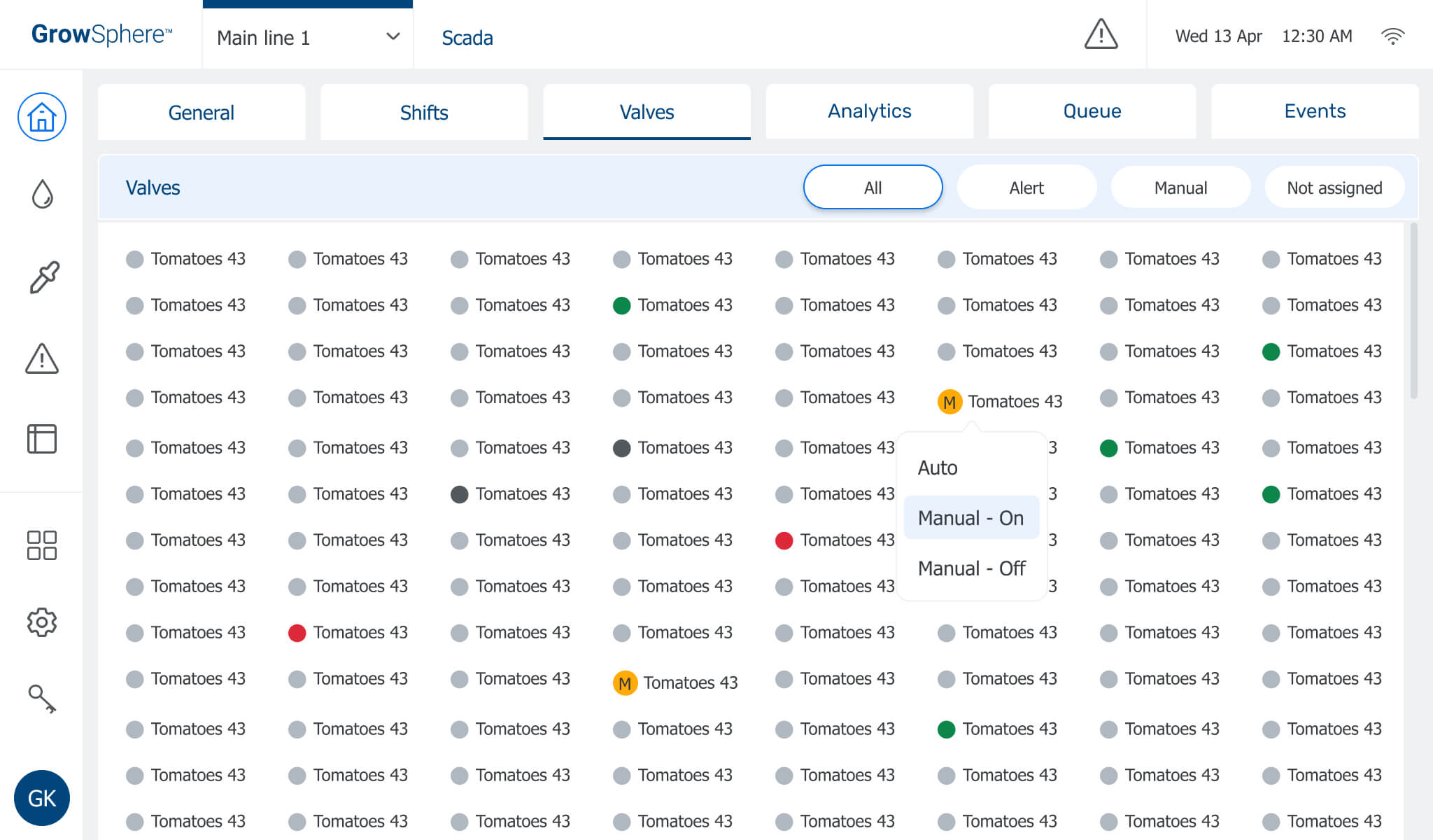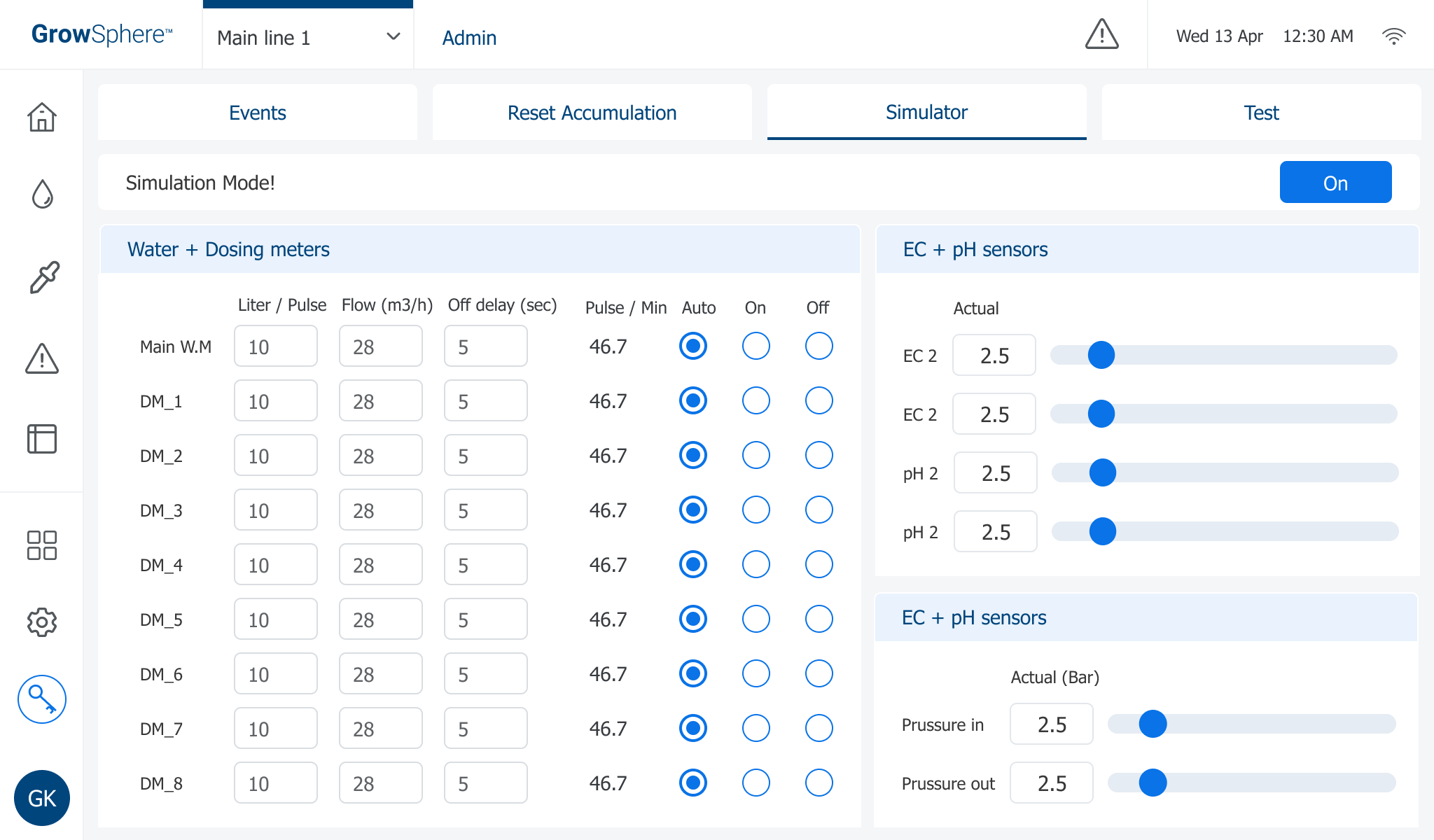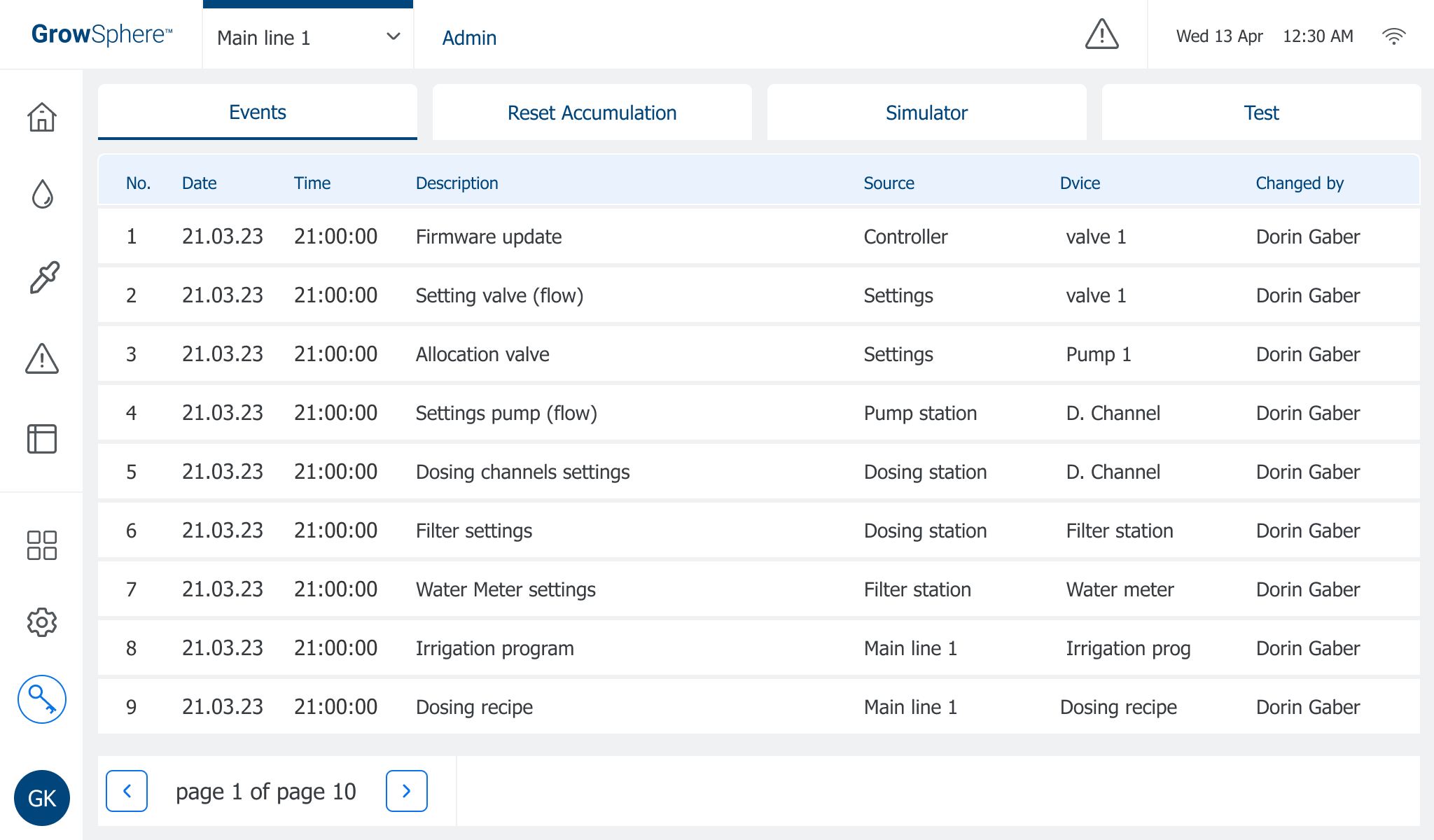
The GrowSphere complex system aims to help growers, at any level, have successful growing by providing the right amount of water and dosing amount required for growth.
The system can be used for monitoring only, monitoring and control, or control only. Also, there are three types of users - the farm manager, the irrigation person, and the agriculture person.
This system is designed for three platforms: desktop, tablet, and mobile platforms. On each platform, we made the necessary adjustments.
* This project is the 10-inch tablet version
Project Info
Challenge
There were several challenges we had to deal with:
Adaptation to several platforms – a complex system and its adaptation to desktop, tablet, and mobile and making decisions about which actions the user will perform
Simplifying complex screens optimally creates a clear flow between the screens and a correct hierarchy within the screens.
Touch screen without adapted gestures – development limitations and adaptation of the tablet product system, the controller, under the existing limitations. Touch screen design without swipes,
A global system and its adaptation to several languages, including English, German, French, Italian, Spanish, and more.
Design adaptation to field conditions – daylight, big and dirty fingers, and more.
Solution
Research led to making decisions and focusing on each platform and the actions we would like the user to perform from each forum.
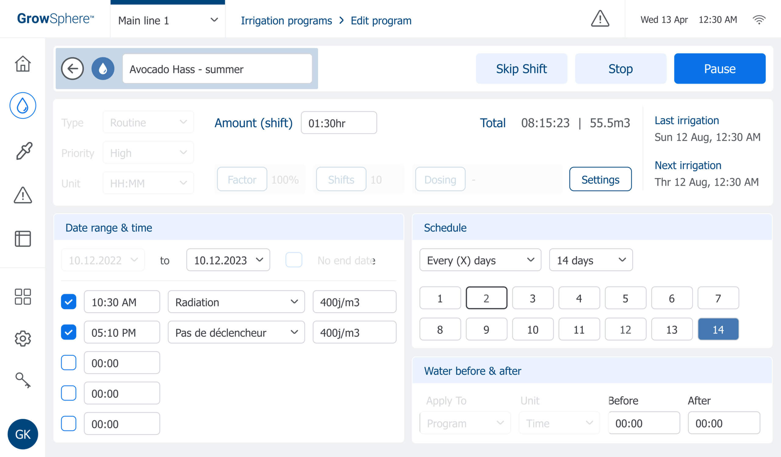
Building a correct flow within the screens and precision in the division into sections and hierarchy within the screens made it possible to insert all the necessary information optimally for each screen.
Creating a simple linear flow in the controller product, a 10-inch tablet, made it possible to deal with the development limitations of the touch screen and develop creative solutions.
Making the product accessible to those with disabilities, adjusting the size of the buttons, colors, and contrast to the terrain conditions.
Adjusting the size of the fields and texts on the screens for all languages and considering all the variables.
![Navigation Screens[קונטרולר]](https://doringaber.co.il/wp-content/uploads/2022/11/Navigation-Screensקונטרולר.png)
Main Goals
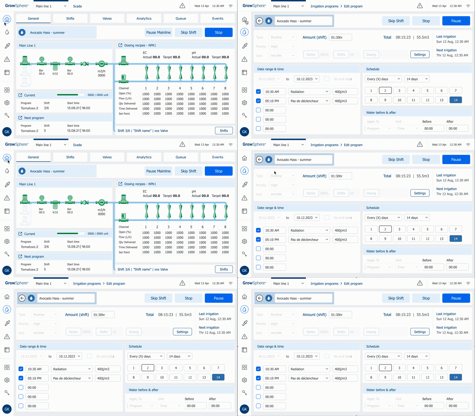
In this project, I want to share with you the process I led to achieving the following goals while achieving the desired product and moving from the version you see below on the top image to the final and improved performance in which the MVP came out on the bottom picture.
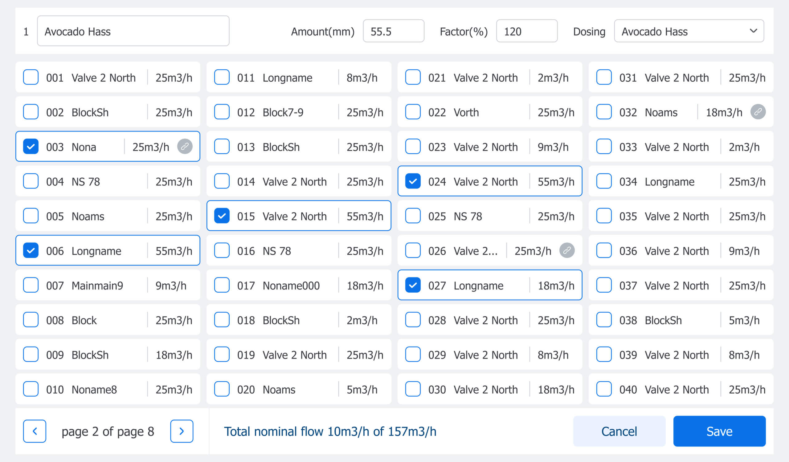
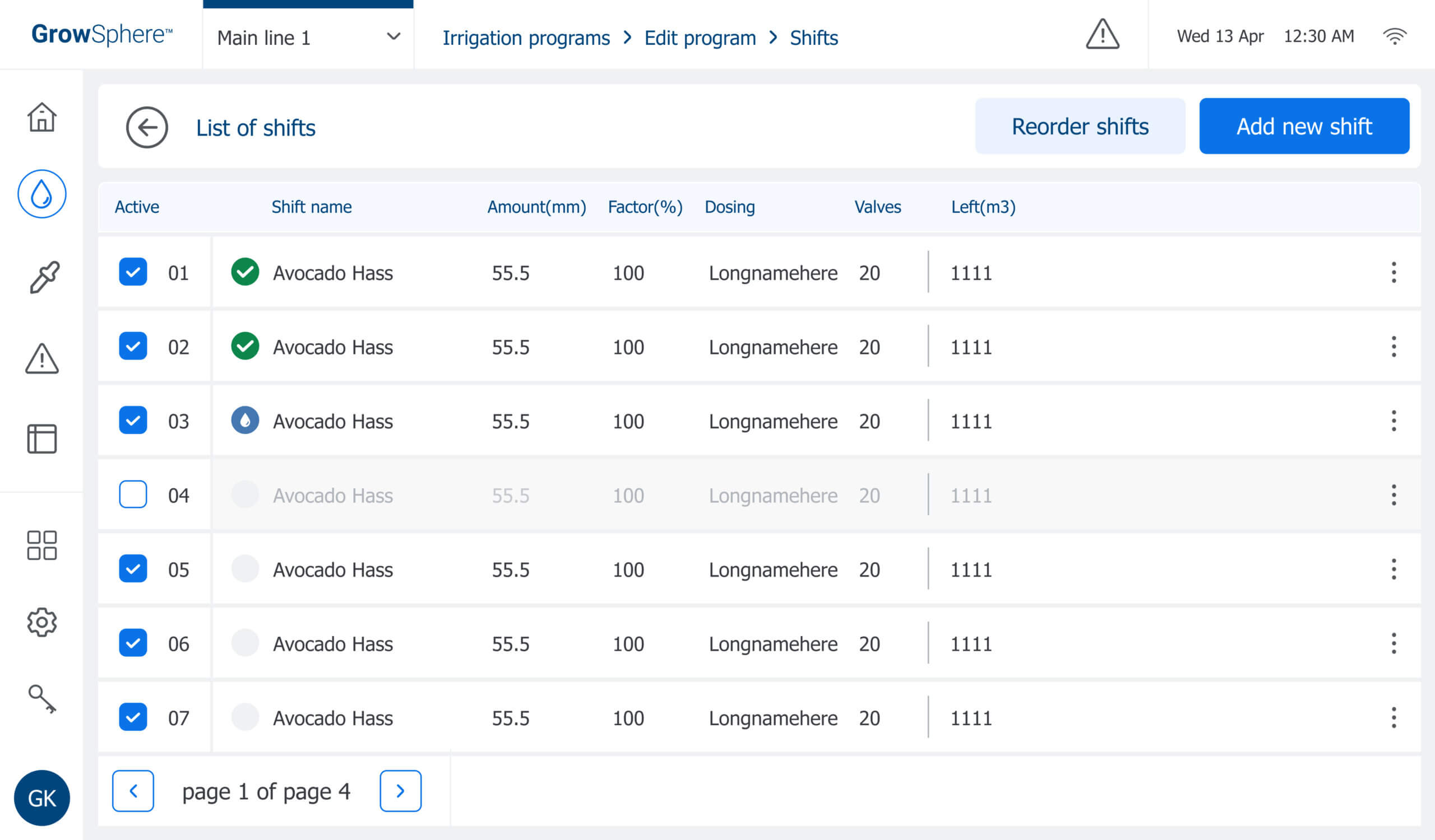
Throughout the work process, there were sweeping changes on all the system screens, but the screen shown here is a significant screen where the user edits the irrigation plan. This screen underwent the most changes in the system and was disassembled and rebuilt.
At this point, I also led the company to transition work on Figma, which until that point was working on Sketch.
Main Goals
1 | Building a clear and simple flow for the user led to the transition to clear textual buttons. |
2 | Minimize the number of clicks – something that led to moving to a side menu, canceling unnecessary tabs, and more. |
3 | Reducing space on the screen and putting all the essential information for the user on one screen, canceling scrolling, or switching to additional screens. |
4 | The accuracy of the hierarchy within the screens and division into the various sessions using UI components adjusted to the need. |
5 | A facelift for the system design and its adaptation to the design of the desktop product. |
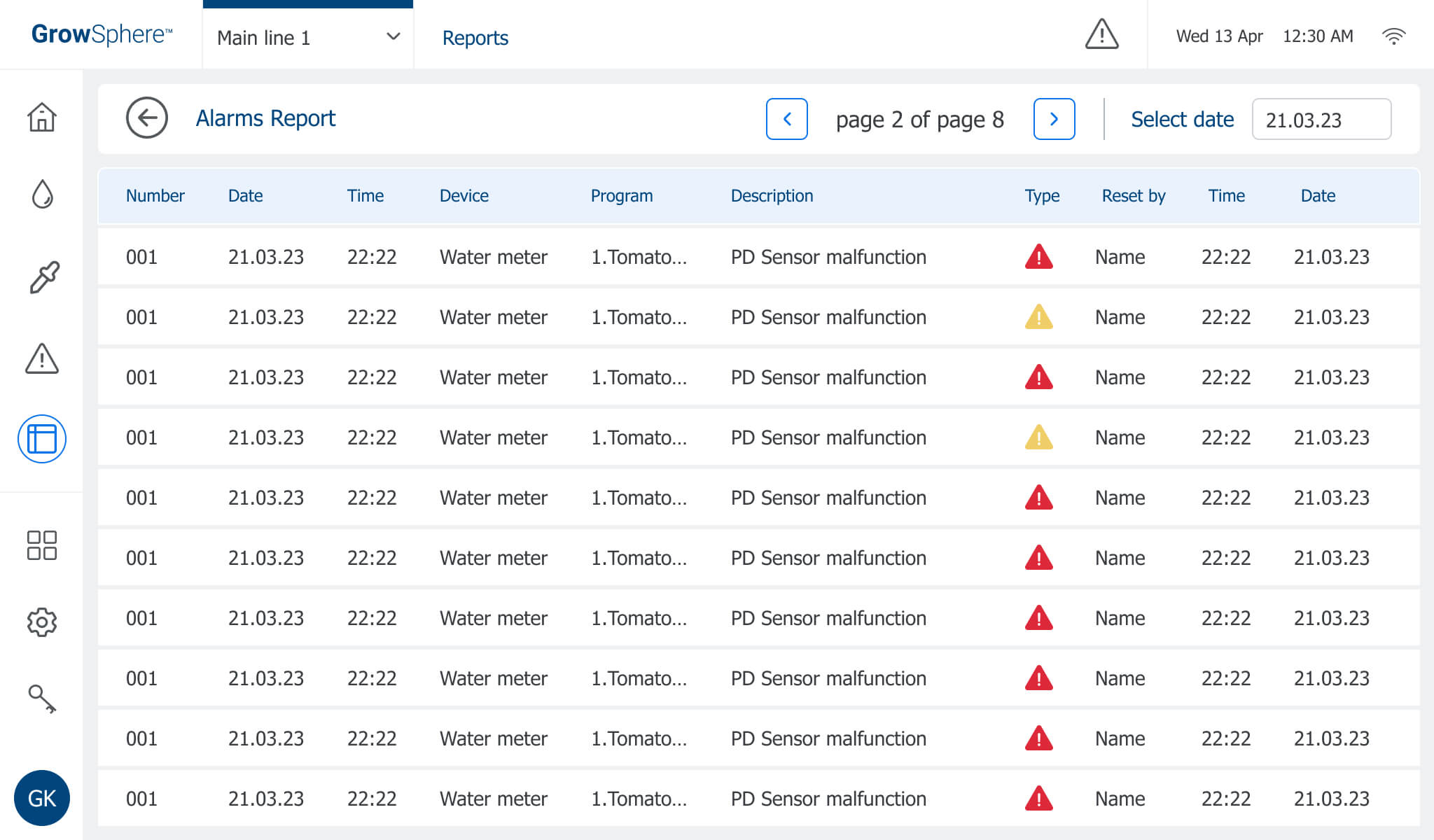
6 | Creating a design distinction between program status and alerts in the different severity so that they are apparent to the user. |
User Testing
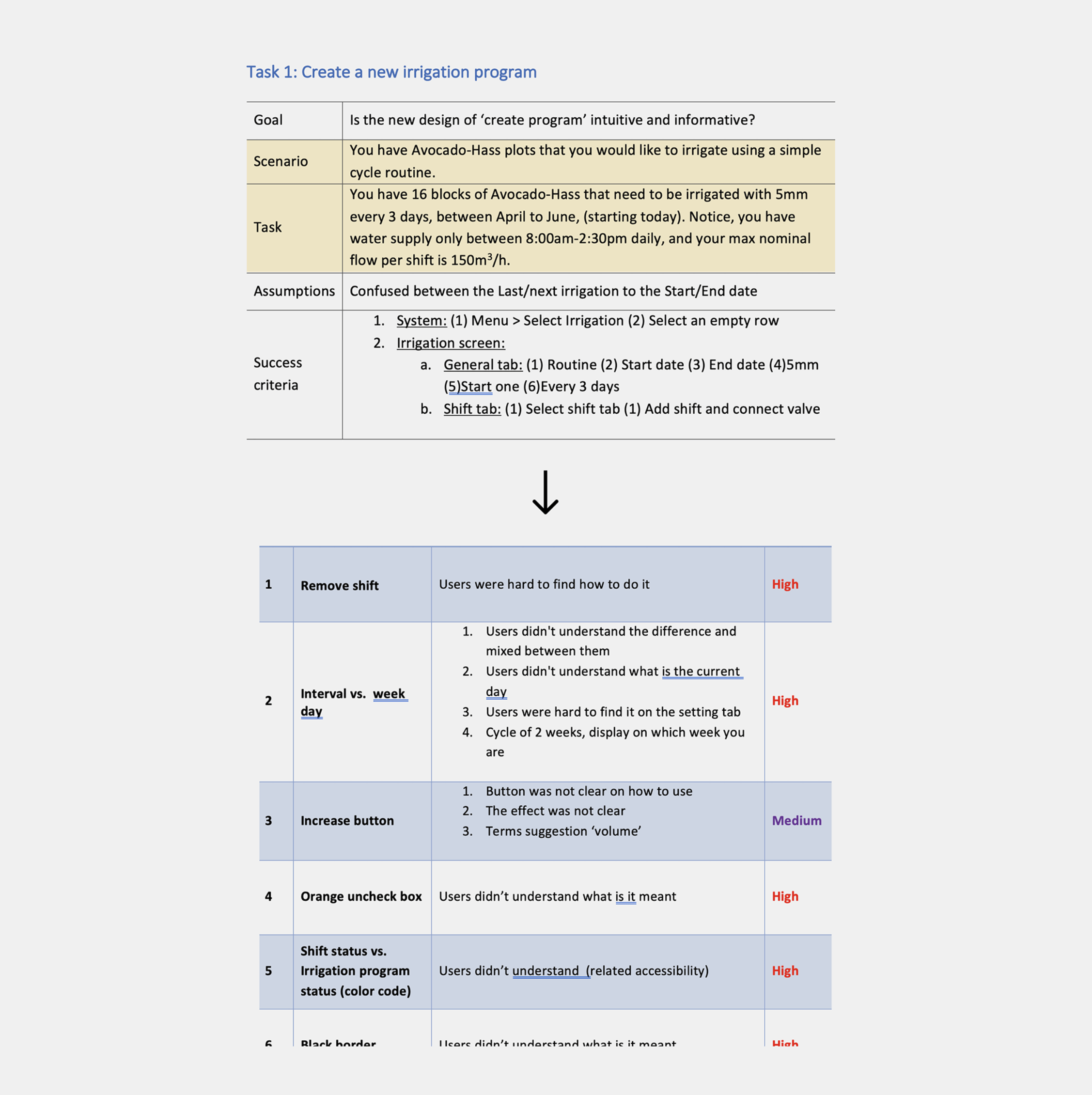
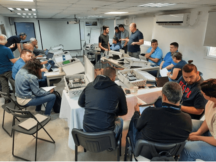
After most of the system’s screens were developed and much brainstorming, we got to the point where we wanted to know if we were on the right path.
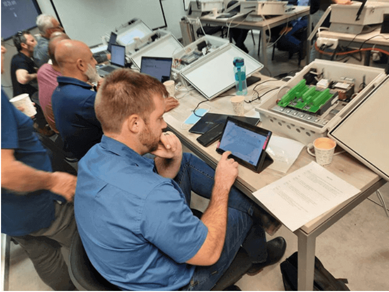
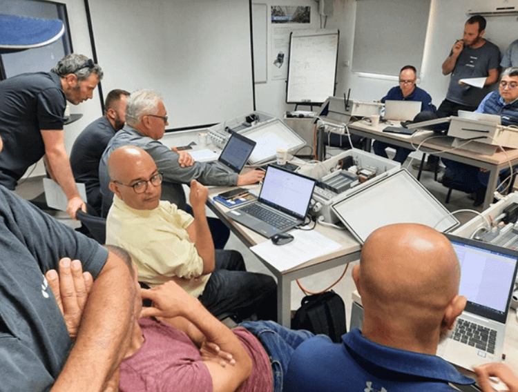
Set a week workshop with all Netafim ambassadors worldwide to test and listen.
we made a usability test, the findings of which led to approval for the changes mentioned above on the system.
Result
The product received a lot of attention and positive feedback from the end client. It was a fresh and promising start.
Thanks for Watching
I’M AVAILABLE FOR HIRE OR FREELANCE

